Push Button
ボタンを使用してパラメーターまたは変数の値を変更
ライブラリ:
Simulink /
Dashboard
説明
Push Button ブロックを使用して、シミュレーション前またはシミュレーション中に、接続された変数またはパラメーターの値を変更します。ボタンを押している間のみに値が変更されるように、またはボタンをもう一度クリックするまで値の変更がラッチされるようにボタンを設定できます。Push Button ブロックを他の Dashboard ブロックと共に使用して、モデルを制御する対話型のダッシュボードを作成します。
Push Button ブロックをダブルクリックしても、シミュレーション中やブロックが選択されているときは、そのダイアログ ボックスは開きません。ブロック パラメーターを編集する場合は、[プロパティ インスペクター] を使用するか、次のようにブロック ダイアログ ボックスを開くことができます。
ブロックが選択されておらず、モデルのシミュレーションが行われていないときに、ブロックをダブルクリックする。
ブロックを右クリックして [ブロック パラメーター] ボタン
 をクリックする。
Push Button のアイコン
ボタンのテキストと一緒に表示されるアイコンを Push Button ブロックに追加できます。基本形状、自動車関連のインジケーター、ワイヤレス アイコンを含む事前定義されたセットからアイコンを選択できます。または、独自のカスタム アイコンをアップロードできます。組み込みアイコンの完全なリストを含む詳細については、アイコン参照してください。
Push Button ブロックにアイコンを追加するときに、ブロックの状態に応じて色が変わるようにアイコンのオンの色とオフの色を設定し、ボタンのテキストを基準にしたアイコンの配置を指定できます。たとえば、この Push Button ブロックは、オンの色が明るい緑色に指定され、ボタンのテキストの左側に配置されている円形のアイコンを使用するように設定されています。
Push Button ブロックのアイコンの設定を使用して、モデル内でのブロックの外観を設定できます。ブロックの外観をさらにカスタマイズする場合は、Customizable Blocks ライブラリの Push Button ブロックを使用することを検討してください。Customizable Blocks ライブラリの Push Button ブロックは、カスタム アイコンの追加をサポートしますが、組み込みアイコンを含みません。
Dashboard ブロックの接続
Dashboard ブロックはモデル要素への接続に端子を使用しません。Dashboard ブロックを接続するには、接続モードを使用します。接続されていないブロックで接続モードに切り替えるには、接続するブロックをポイントし、[接続] ボタン  をクリックします。接続されているブロックで接続モードに切り替えるには、ブロックを選択すると表示される省略記号 (…) をポイントし、展開されるアクション メニューで [接続] ボタンをクリックします。
制御ブロックをモデル内のパラメーターに接続するか、制御ブロックの接続を変更するには、接続モードに切り替えます。接続するパラメーターが含まれているブロックを選択します。表示されるリストから、接続するパラメーターを選択します。次に、Dashboard ブロックをポイントし、[接続完了] ボタン をクリックします。
モデルのブロック線図を更新するまで、制御ブロックは値が変数であるパラメーターに接続できません。シミュレーションが実行されていないときに、値が変数であるパラメーターに接続するか、接続されているパラメーターの値である変数の値を変更するには、Ctrl+D を押してモデルのブロック線図を更新します。
スカラー値をもつパラメーター、あるいは行列または構造体の要素に接続できます。詳細については、Connect Dashboard Blocks to Simulink Modelを参照してください。
Dashboard ブロックは Stateflow® チャートにも接続できます。詳細については、Dashboard ブロックと Stateflow との接続 (Stateflow)を参照してください。
次のアニメーションは、Push Button ブロックをモデルに接続する方法を示しています。

パラメーターのログ記録
Dashboard ブロックに接続されている調整可能なパラメーターはシミュレーション データ インスペクターに記録されます。シミュレーション データ インスペクターでは、記録された信号データと共にパラメーター値を表示できます。UI を使用して、または関数Simulink.sdi.exportRunを使用して、シミュレーション データ インスペクターからパラメーター データをエクスポートすることで、MATLAB® ワークスペース内のログに記録されたパラメーター データにアクセスできます。シミュレーション データ インスペクターの UI を使用したデータのエクスポートの詳細については、Export Data From Simulation Data Inspector to Workspace or Fileを参照してください。パラメーター データは Simulink.SimulationData.Parameter オブジェクトに格納され、エクスポートされた Simulink.SimulationData.Dataset の要素としてアクセスできます。
例
Push Button ブロックを使用すると、シミュレーション中に接続されている変数またはパラメーターの値を変更できます。たとえば、モデル pushIncrease では、Increase amplitude という名前の Push Button ブロックが Constant ブロックの [値] パラメーターに接続されています。Push Button ブロックを押すと、Constant ブロックの値が 5 に変わります。

モデルのシミュレーションを実行します。シミュレーション中に Constant ブロックの値を 1 から 5 に増加するには、Push Button ブロックを押します。

拡張例
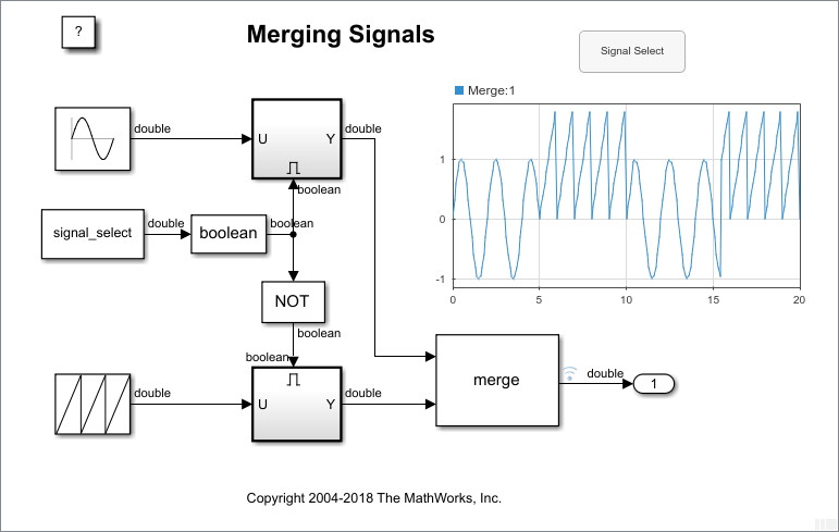
Push Button ブロックを使用した信号のマージの制御
モデル mergedemo の出力に渡される信号を Push Button ブロックを使用して制御する。
制限
Dashboard Scope ブロックおよび Display ブロックを除き、Dashboard ブロックは実数のスカラー信号にのみ接続できます。
コメントアウトされたブロックには、[ブロック パラメーター] ダイアログ ボックスの [接続] テーブルを使用して Dashboard ブロックを接続することはできません。コメント化されたブロックに接続モードを使用して Dashboard ブロックを接続した場合、ブロックのコメントを解除するまでは Dashboard ブロックに接続された値が表示されません。
Dashboard ブロックは参照モデル内のモデル要素には接続できません。
モデルの階層構造をシミュレーションすると、参照モデル内の Dashboard ブロックで更新は実行されません。
Dashboard ブロックは、ラピッド アクセラレータ シミュレーションをサポートしていません。
シミュレーション中に Dashboard ブロックを変数またはパラメーターに接続すると、その変数またはパラメーターのデータはシミュレーション データ インスペクターに記録されません。シミュレーション データ インスペクターに変数とパラメーターのデータを記録するには、シミュレーションを実行する前に Dashboard ブロックを変数またはパラメーターに接続します。
[既定のパラメーター動作] を [インライン] に設定してエクスターナル モードでモデルをシミュレーションするときに、Dashboard ブロックがパラメーターと変数の値を変更するように見える場合があります。ただし、その変更はシミュレーションに伝播されません。たとえば、Gain ブロックには Dashboard ブロックを使用して [ゲイン] パラメーターに加えられた変更が表示されますが、シミュレーションで使用された [ゲイン] 値は変更されません。
パラメーター
接続
このブロックは、パラメーターの値を制御するブロックである、制御ブロックです。このブロックを、制御対象の値を持つパラメーターに接続します。スカラー値をもつパラメーター、または行列の要素に接続できます。
Dashboard ブロックはモデル要素への接続に端子を使用しません。Dashboard ブロックを接続するには、接続モード、Simulink® ツールストリップ、または [ブロック パラメーター] ダイアログ ボックスの [接続] テーブルを使用します。詳細については、Connect Dashboard Blocks to Simulink Modelを参照してください。
[接続] テーブルを使用して、スカラー値をもつパラメーターを接続するには、次のようにします。
ブロックを選択します。
プロパティ インスペクターの [パラメーター] タブで、[接続] または [変更] をクリックします。
接続するパラメーター値が含まれているブロックを選択します。
表示されるテーブルで、パラメーターを選択します。
[適用] をクリックします。
値が変数として指定されているパラメーターに接続するか、接続されている変数の値を変更するには、まず、モデルのブロック線図を更新する必要があります。モデルのブロック線図を更新するには、Ctrl+D を押します。
Dashboard ブロックは Stateflow チャートにも接続できます。詳細については、Dashboard ブロックと Stateflow との接続 (Stateflow)を参照してください。
プログラムでの使用
プログラムで制御ブロックをパラメーターに接続できます。パラメーターを表す Simulink.HMI.ParamSourceInfo オブジェクトを定義します。次に、Binding パラメーターの値をオブジェクトに設定します。Binding パラメーターの値を設定するには、set_param 関数を使用します。
たとえば、vdp という名前のモデルに、myButton という名前の Push Button ブロックと、x1 という名前の Integrator ブロックが含まれているとします。Push Button ブロックを Integrator ブロックの Initial Condition パラメーターに接続するには、次のコードを使用します。
blockPath1 = "vdp/myButton";
blockPath2 = "vdp/x1";

myObj = Simulink.HMI.ParamSourceInfo;
myObj.BlockPath = Simulink.BlockPath(blockPath2);
myObj.ParamName = 'InitialCondition';

set_param(blockPath1,Binding=myObj)
| パラメーター: | Binding |
| 値: | Simulink.HMI.ParamSourceInfo object |
例: set_param(gcb,Binding=myObj)
メイン
モデル内の Push Button ブロックに表示されるテキスト。
ヒント
ブロックの状態に応じて異なるテキストを表示するボタンを設計するには、Customizable Blocks ライブラリの Push Button ブロックを使用します。
プログラムでの使用
ブロック パラメーターの値をプログラムで設定するには、set_param 関数を使用します。
| パラメーター: | ButtonText |
| 値: | 'Button' (既定値) | button label text |
| データ型: | string | char |
例: set_param(gcb,ButtonText="My Button")
ボタンが押されたとき、またはラッチされたときに、接続されているブロック パラメーターに割り当てられる値。
ヒント
[ブロック タイプ] パラメーターを使用して、クリックに対するブロックの対応を設定します。
モーメンタリ—ボタンを押している間のみ [オンの値] が適用されます。ラッチ— ボタンをクリックしたときに状態の変更がラッチされ、もう一度クリックするまで [オンの値] が適用されます。
プログラムでの使用
ブロック パラメーターの値をプログラムで設定するには、set_param 関数を使用します。
| パラメーター: | OnValue |
| 値: | '1' (既定値) | scalar formatted as string or character vector |
例: set_param(gcb,OnValue="0")
クリックに対するボタンの応答を指定します。
モーメンタリ—ボタンを押している間のみ [オンの値] が適用されます。ラッチ— ボタンをクリックしたときに状態の変更がラッチされ、もう一度クリックするまで [オンの値] が適用されます。
プログラムでの使用
ブロック パラメーターの値をプログラムで設定するには、set_param 関数を使用します。
| パラメーター: | ButtonType |
| 値: | 'Momentary' (既定値) | "Momentary" | "Latch" |
例: set_param(gcb,ButtonType="Latch")
ブロック ラベルの位置。ブロックがモデル内の要素に接続されている場合、ラベルは接続された要素の名前です。
プログラムでの使用
ブロック パラメーターの値をプログラムで設定するには、set_param 関数を使用します。
| パラメーター: | LabelPosition |
| 値: | 'Hide' (既定値) | "Hide" | "Bottom" | "Top" |
例: set_param(gcb,LabelPosition="Top")
形式
ブロックの背景の不透明度。0 ~ 1 のスカラー値として指定します。指定した値が 1 の場合、背景は完全に不透明になります。
プログラムでの使用
ブロック パラメーターの値をプログラムで設定するには、set_param 関数を使用します。
| パラメーター: | Opacity |
| 値: | '1' (既定値) | scalar with values between 0 and 1 formatted as string or character vector |
例: set_param(gcb,Opacity="0.5")
テキストを含むブロックの前景色。標準色のパレットから色を選択するか、カスタムの色を指定できます。
プログラムでの使用
ブロック パラメーターの値をプログラムで設定するには、set_param 関数を使用します。
| パラメーター: | ForegroundColor |
| 値: | [r g b] vector with values between 0 and 1 formatted as a string or character vector |
例: set_param(gcb,ForegroundColor="[1 0 1]")
背景色。標準色のパレットから色を選択するか、カスタムの色を指定できます。
プログラムでの使用
ブロック パラメーターの値をプログラムで設定するには、set_param 関数を使用します。
| パラメーター: | BackgroundColor |
| 値: | [r g b] vector with values between 0 and 1 formatted as a string or character vector |
例: set_param(gcb,BackgroundColor="[1 0 1]")
アイコン
ボタンのテキストと一緒にまたはボタンのテキストの代わりに表示されるアイコンを Push Button ブロックに追加できます。形状、自動車関連、ワイヤレスの組み込みアイコンから選択できます。または、独自のカスタム SVG ファイル、PNG ファイル、JPEG ファイルをアップロードしてアイコンとして使用できます。
アイコン オプションを表示するには、ブロック ダイアログ ボックスの [アイコン] タブで [アイコン タイプ] を選択します。独自のカスタム アイコンを使用するには、[カスタム] を [アイコン タイプ] として選択し、イメージ ファイルをアップロードします。
アイコンを追加する場合、以下のパラメーターを使用してアイコンの外観を設定できます。
アイコン配置 — ボタンのテキストを基準としたアイコンの配置
オンの色 — ブロックが押されるかラッチされ、[オンの値] が接続されているパラメーターに適用されているときのアイコンの色
オフの色 — ブロックが押されていないまたはラッチされていない状態で、[オンの値] が接続されているパラメーターに適用されていないときのアイコンの色
アイコンの [オンの色] と [オフの色] を指定するには、[アイコンの色をカスタマイズ] を選択しなければなりません。
形状アイコン
| アイコン | 基本形状のライブラリ ブロック名 | プログラムで使用する値 |
|---|---|---|
|
| Check1 | Check1 |
|
| Check2 | Check2 |
|
| Check3 | Check3 |
|
| Check4 | Check4 |
|
| Circle | Circle |
|
| Ex1 | Ex1 |
|
| Ex2 | Ex2 |
|
| Ex3 | Ex3 |
|
| Ex4 | Ex4 |
|
| Face | Face |
|
| Frown1 | Frown1 |
|
| Frown2 | Frown2 |
|
| Hexagon | Hexagon |
|
| Pentagon | Pentagon |
|
| Rectangle | Rectangle |
|
| Smile1 | Smile1 |
|
| Smile2 | Smile2 |
|
| Solid Face | SolidFace |
|
| Solid Frown1 | SolidFrown1 |
|
| Solid Frown2 | SolidFrown2 |
|
| Solid Smile1 | SolidSmile1 |
|
| Solid Smile2 | SolidSmile2 |
|
| Square | Square |
|
| Triangle | Triangle |


自動車関連アイコン
| アイコン | 自動車関連のインジケーター ランプのライブラリ ブロック名 | プログラムで使用する値 |
|---|---|---|
|
| Adaptive Cruise Control | AdaptiveCruiseControl |
|
| Adaptive Cruise Control Failure | AdaptiveCruiseControlFailure |
|
| Antilock Brake System | AntilockBrakeSystem |
|
| Battery | Battery |
|
| Check Engine | CheckEngine |
|
| Check Engine2 | CheckEngine2 |
|
| Cruise Control | CruiseControl |
|
| Eco Mode | EcoMode |
|
| Electronic Stability | ElectronicStability |
|
| Engine | Engine |
|
| Engine Coolant Temp | EngineCoolantTemp |
|
| Engine Failure | EngineFailure |
|
| Engine Heating | EngineHeating |
|
| Engine Oil | EngineOil |
|
| Exterior Bulb Failure | ExteriorBulbFailure |
|
| Front Fog Light | FrontFogLight |
|
| Fuel | Fuel |
|
| Hazards | Hazards |
|
| Headlamp Leveling | HeadlampLeveling |
|
| High Beams | HighBeams |
|
| Hill Descent Control | HillDescentControl |
|
| Lighting Switch | LightingSwitch |
|
| Low Beams | LowBeams |
|
| Parking Assistance | ParkingAssistance |
|
| Rear Fog Light | RearFogLight |
|
| Side Lights | SideLights |
|
| Stability Control | StabilityControl |
|
| Stability Control Off | StabilityControlOff |
|
| Tire Monitor | TireMonitor |
|
| Traction Control | TractionControl |
|
| Traction Control Off | TractionControlOff |
|
| Traction Control Failure | TractionControlFailure |
|
| Turn Signal Left | TurnSignalLeft |
|
| Turn Signal Right | TurnSignalRight |


ワイヤレス アイコン
| アイコン | アイコン名 | プログラムで使用する値 |
|---|---|---|
|
| Network | Network |
|
| Network No Signal | NetworkNoSignal |
|
| Network Transmission | NetworkTransmission |
|
| Network3G | Network3G |
|
| Network4G | Network4G |
|
| Network5G | Network5G |


ヒント
ツールストリップ内の [ボタン] タブを使用して、Push Button ブロックのアイコンを変更できます。
Push Button ブロックの外観をさらにカスタマイズする場合は、Customizable Blocks ライブラリの Push Button ブロックを使用して、独自のボタンを設計することを検討してください。
Customizable Blocks ライブラリの Push Button ブロックは、カスタム アイコンの追加をサポートしますが、組み込みアイコンを含みません。
アイコンのオンの色とオフの色は、次の SVG 要素に適用できます。
altGlyphcircleellipsepathpolygonrecttexttextPathtreftspan
プログラムでの使用
ブロック パラメーターの値をプログラムで設定するには、set_param 関数を使用します。
| パラメーター: | Icon |
| 値: | 'Default' (既定値) | icon name formatted as string or character vector |
例: set_param(gcb,Icon="NetworkTransmission")
ボタンのテキストを基準としたアイコンの配置。ボタンのテキストを指定しないと、アイコンは常にブロックの中央に配置されます。
プログラムでの使用
ブロック パラメーターの値をプログラムで設定するには、set_param 関数を使用します。
| パラメーター: | IconAlignment |
| 値: | 'Left' (既定値) | "Left" | "Center" | "Right" |
例: set_param(gcb,IconAlignment="Center")
Push Button ブロックにアイコンを追加するときに、ブロックの状態を反映してアイコンの色が変わるようにオンの色とオフの色を指定できます。アイコンの [オンの色] と [オフの色] を使用して指定するには、[アイコンの色をカスタマイズ] を選択します。
プログラムでの使用
ブロック パラメーターの値をプログラムで設定するには、set_param 関数を使用します。
| パラメーター: | IconColor |
| 値: | 'Off' (既定値) | "on" | "off" |
例: set_param(gcb,IconColor="on")
Push Button ブロックにアイコンを追加するときに、ブロックの状態を反映してアイコンの色が変わるようにオンの色とオフの色を指定できます。[オンの色] は、ブロックが押されるかラッチされ、[オンの値] が接続されているパラメーターに適用されているときのアイコンの色を指定します。標準色のパレットから色を選択するか、カスタムの色を指定できます。
依存関係
[オンの色] パラメーターを有効にするには、[アイコンの色をカスタマイズ] を選択します。
プログラムでの使用
ブロック パラメーターの値をプログラムで設定するには、set_param 関数を使用します。
| パラメーター: | IconOnColor |
| 値: | [r g b] vector with values between 0 and 1 |
例: set_param(gcb,IconOnColor=[1 0 1])
Push Button ブロックにアイコンを追加するときに、ブロックの状態を反映してアイコンの色が変わるようにオンの色とオフの色を指定できます。[オフの色] は、ブロックが押されていないまたはラッチされていない状態で、[オンの値] が接続されているパラメーターに適用されていないときのアイコンの色を指定します。標準色のパレットから色を選択するか、カスタムの色を指定できます。
依存関係
[オンの色] パラメーターを有効にするには、[アイコンの色をカスタマイズ] を選択します。
プログラムでの使用
ブロック パラメーターの値をプログラムで設定するには、関数 set_param を使用します。
| パラメーター: | IconOffColor |
| 値: | [r g b] vector with values between 0 and 1 |
例: set_param(gcb,IconOffColor=[1 0 1])
ブロックの特性
データ型 |
|
直達 |
|
多次元信号 |
|
可変サイズの信号 |
|
ゼロクロッシング検出 |
|
拡張機能
バージョン履歴
R2015a で導入R2023b 以降では、新しいウィンドウでダッシュボード パネルを開くことができます。そうするには、パネルを選択し、表示された省略記号の上にマウスをポイントします。展開されたアクション メニューで、[新規ウィンドウで開く] ボタン  をクリックします。
モデル ウィンドウとは別個に、パネルを含む新しいウィンドウを最小化および復元できます。パネル ウィンドウで、シミュレーションの実行、一時停止、停止、およびステップ実行を行うことができます。パネル ウィンドウで、パネルおよびパネルに含まれているブロックを編集できます。
パネルをモデル キャンバスに戻すには、パネル ウィンドウ ツールストリップで [キャンバスで開く]  をクリックします。
新しいウィンドウでパネルを開く操作の詳細については、Open Panels in New Windowを参照してください。