Process Data and Explore Features in Diagnostic Feature Designer
This example shows how to process your data in the app in preparation for feature extraction. If you want to follow along with the steps interactively, use the data you imported in Import and Visualize Ensemble Data in Diagnostic Feature Designer. Use Open Session to reload your session data using the file name you provided.

If you have no session data, execute the steps for loading and importing data in Import and Visualize Ensemble Data in Diagnostic Feature Designer.
A key step in predictive maintenance algorithm development is identifying condition indicators. Condition indicators are features in your system data whose behavior changes in a predictable way as the system degrades. A condition indicator can be any feature that is useful for distinguishing normal from faulty operation or for predicting remaining useful life. A useful feature clusters similar system statuses together and sets different statuses apart.
Diagnostic Feature Designer lets you design features that provide these diagnostics.
For some features, you can generate features directly using signals you imported.
For other features, you must perform additional signal processing, such as filtering and averaging, to obtain meaningful results.
The processing you perform depends both on the computational requirements of the feature and the characteristics of your systems and your system data. This example shows how to:
Process your data in preparation for feature extraction
Generate features of various types
Interpret the effectiveness of your features in histograms
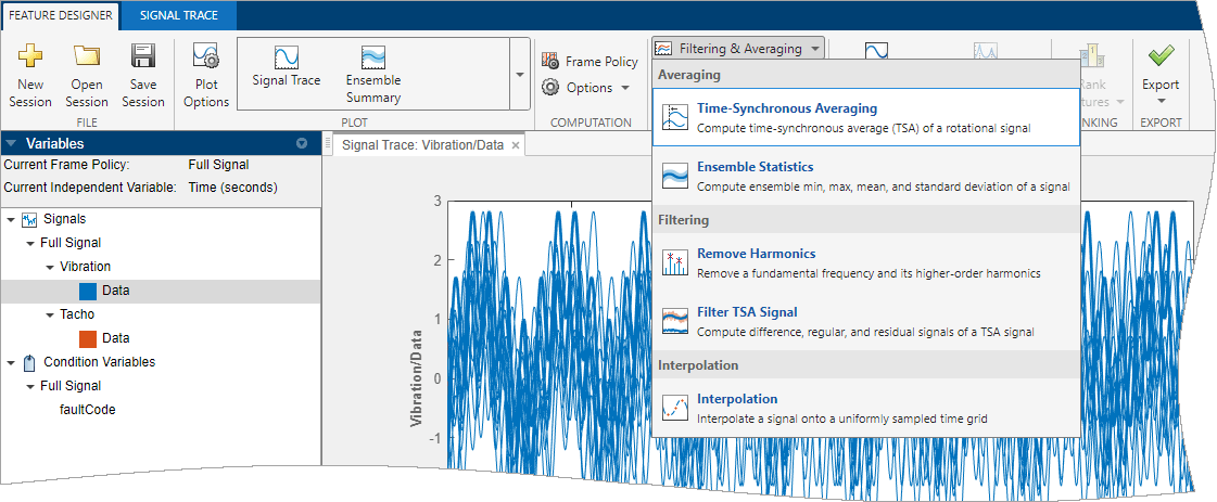
Perform Time-Synchronous Averaging
The data for this system represents a transmission system with rotating parts. The variables include tachometer outputs that precisely mark the completion of each shaft revolution. The data, therefore, is an ideal candidate for time-synchronous averaging.
Time-synchronous averaging (TSA) is a common technique for analyzing data from rotating machinery. TSA averages rotation by rotation, and filters out any disturbances or noise that is not coherent with the rotation.
TSA is useful for isolating fault signatures that repeat each rotation, such as perturbations from gear-tooth defects. Features generated from a TSA signal rather than the original vibration signal provide clearer differentiation for rotational fault conditions. This advantage holds true even for features that are not specifically for rotating machinery.
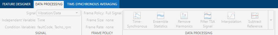
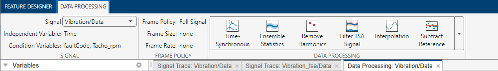
To compute the TSA of the vibration data, first select the signal to average,
Vibration/Data, in the variables pane. Then, select
Filtering & Averaging > Time-Synchronous Averaging.
A new Time-Synchronous Averaging tab appears.
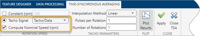
Since you have a tacho signal, select Tacho signal and
Tacho/Data. You can leave Compute Nominal
Speed (rpm) selected, but this tutorial does not use the nominal rpm
information.
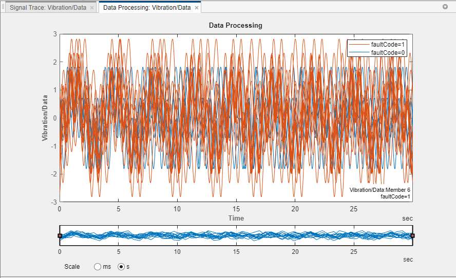
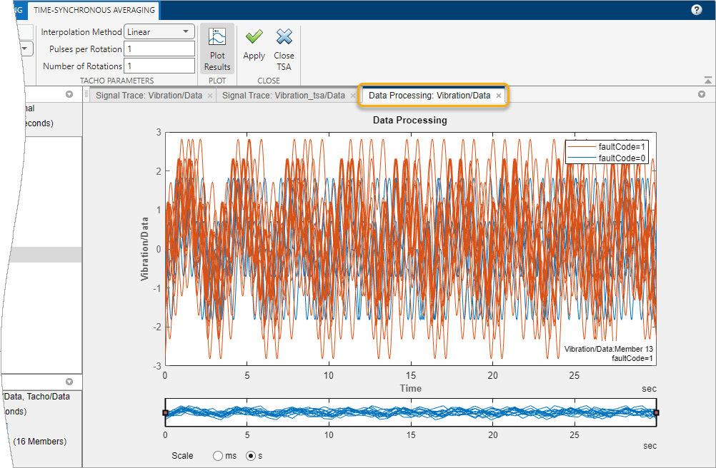
Beneath the tab, the plot tab Data Processing: Vibration/Data displays the source signal for the TSA signal.
Click Apply to start the TSA computation for each of the 16
members of the ensemble. A progress bar shows the status while the computation
progresses. When the computation concludes, the app adds a new variable
Vibration_tsa to the signal list and plots the
signal.

Note that the time axis of the TSA signal plot is less than four seconds long. The original vibration data was 30 seconds long. The shorter timespan reflects the duration of a single rotation for each member.
The member shaft rates for these signals diverge. This divergence is evident in the increasing misalignment of the peaks during the rotation, and the fact that the member traces stop at different times.
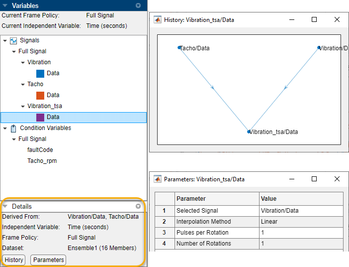
Use the Details pane to find out more about the TSA signal. In this pane, you can see that the TSA signal is computed from the vibration and tacho signals. Click History to see a plot of the TSA signal processing history. Click Parameters to see a list of the processing parameters that you used.
When the TSA computation completes, the Signal Trace tab for the TSA signal replaces the Time-Synchronous Averaging tab and the Data Processing tab. If you want to return to the Time-Synchronous Averaging tab, click the plot tab Data Processing: Vibration/Data.
The app restores both toolstrip tabs, with the TSA tab active and the data processing tab inactive.
If you want to perform similar processing on another variable, click Close TSA. The Data Processing tab activates. From that tab, you can change the signal to process. Then, from the data processing gallery, you can select TSA processing or any other processing that is compatible with your signal selection. The processing tab that you select retains any settings that you specified previously in the session.
Compute Power Spectrum
The TSA signal gives you enough information to start generating time-domain
features, but you must provide a spectrum to explore spectral features. To generate
a power spectrum, select the new TSA signal Vibration_tsa/Data in
the variables pane. Then, click Spectral Estimation to bring up
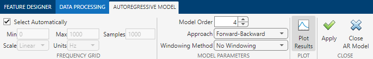
the spectrum options. From these options, select Autoregressive
Model.

The Autoregressive Model tab provides parameters that you can modify. Accept the default values by clicking Apply.
The power spectrum processing results in a new variable,
Vibration_ps/SpectrumData. The associated icon represents a
frequency response.
A plot of the spectrum appears in the plot area. As with Signal Trace, a Power Spectrum tab provides options for plotting. These options are similar to Signal Trace. The plot has no Panner option because Panner does not work for spectral plots unless the spectra are frame-based (segmented).
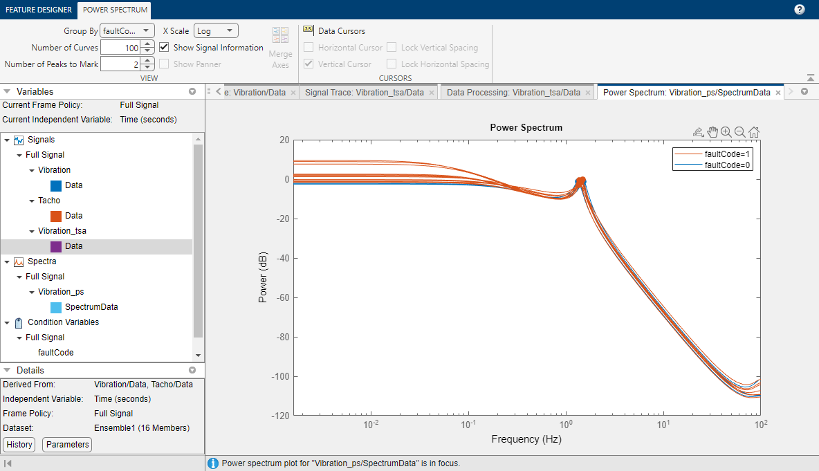
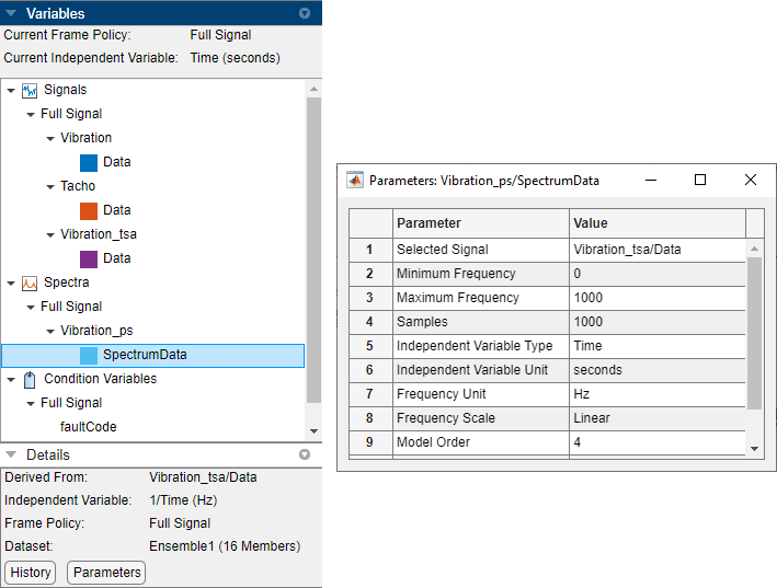
Select Vibration_ps/SpectrumData. The details pane
shows that this signal is derived from the TSA signal. The processing parameters
list is more extensive than that of the TSA processing parameters.
Generate Features
Signal Features
Generate features based on general data statistics, using the TSA signal as your source. Select Time-Domain Features > Signal Features.
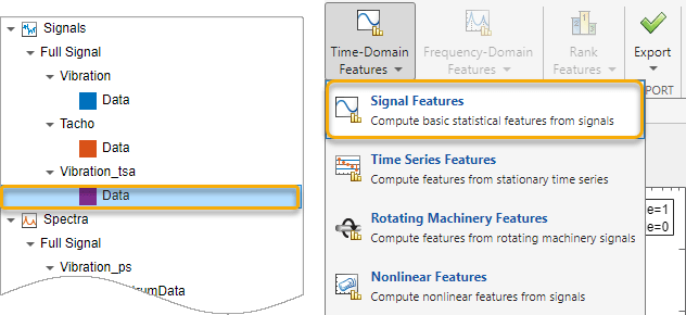
As with data processing, preselect your source signal before
choosing a feature option. Select Vibration_tsa/Data
and then click Signal Features to bring up the
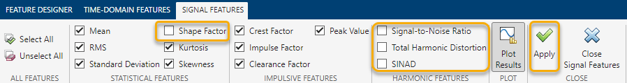
Signal Features tab. By default, all features are
selected. Clear the selections for Shape Factor and all
options in Harmonic Features.
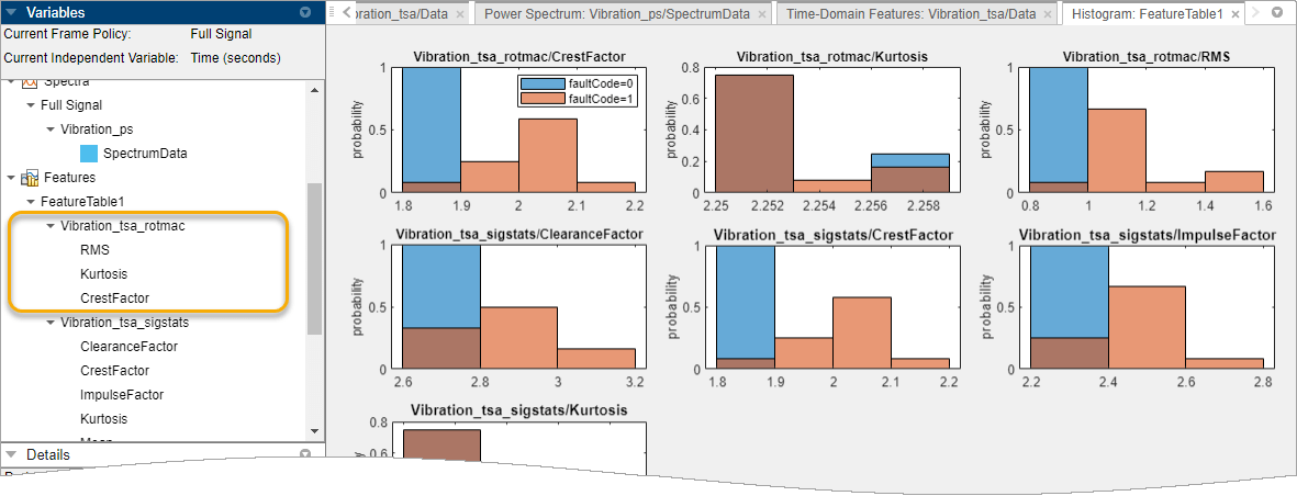
For every selected feature, the app computes a value for each ensemble member and displays the results in a histogram. Each histogram contains bins containing the number of feature values that fall within the bin range. The Histogram tab displays parameters that determine the content and resolution of the histograms.
The histogram groups, or color codes, the data according to the condition
variable faultCode in Group By.
Blue data is healthy (faultCode = 0) and orange data is
degraded (faultCode = 1), as indicated by the legend (color
coding might appear different in your session). For feature values where the
healthy and degraded labels overlap, the color appears brown because of the
overlap between blue and orange.
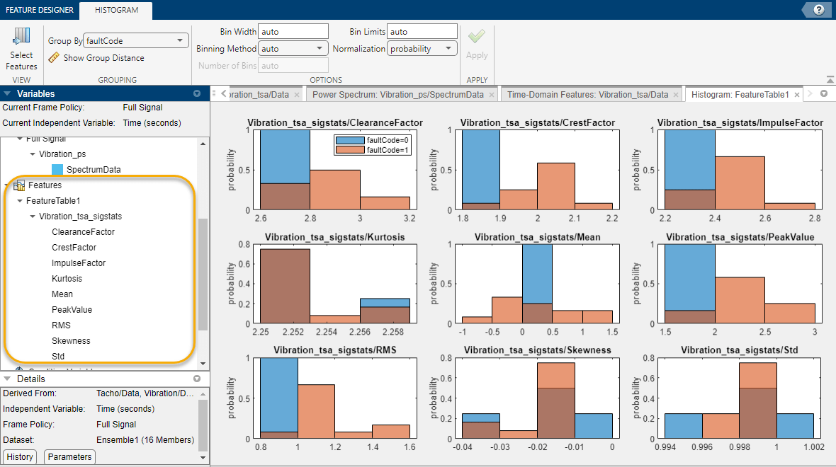
You can get a rough idea of which features are effective by assessing which
ones clearly segregate blue data from orange data.
CrestFactor (top center) and RMS
(bottom left) appear effective, as they have only small areas of overlap.
Conversely, Skewness (bottom center) and
Kurtosis (middle left) have large amounts of overlap.
These features appear ineffective for this data and this condition
variable.
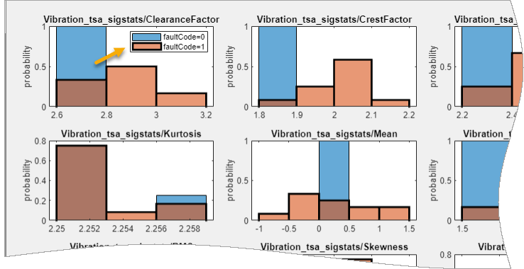
If you want to see how the histogram represents a specific condition, click the color box that represents that condition in the legend. The app outlines the parts of the histogram that represent where that condition is present. This condition outline is particularly useful when you are evaluating histograms for more than two conditions.
By default, the app plots the histograms for all the features in the feature table. You can focus on a subset of histograms by using Select Features. Use Select Features to limit the histogram plots to the first four in the feature table. Because the features are not yet ranked, the app sorts the features by name. When you use Select Features after ranking, you can select ranking order (the default) or name order.
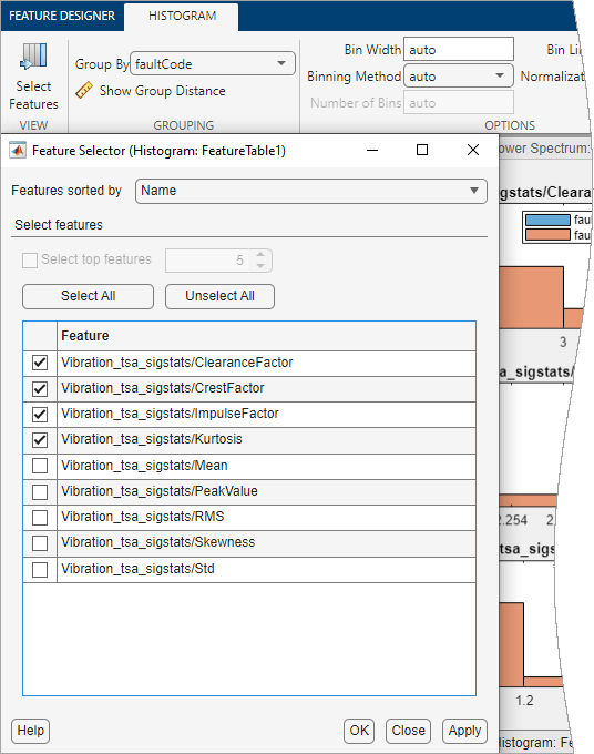
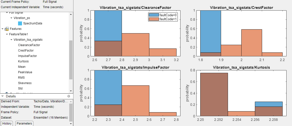
The histogram view now includes only the features you select.
Control the appearance of the histograms using the parameters in the
Histogram tab, which activates when you generate the
histograms. The CrestFactor feature appears to separate
healthy and unhealthy data almost completely. Investigate whether this result is
sensitive to resolution. In the Histogram tab, the
auto setting of bin width results in a resolution
of 0.1 for CrestFactor. Enter a bin width 0.05, and click
Apply.
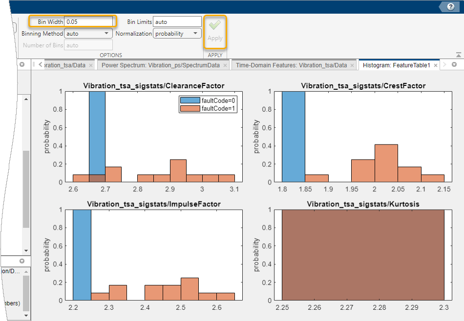
At this resolution, both CrestFactor and
ImpulseFactor appear to completely separate healthy from
degraded data. ClearanceFactor still has some mixed data, but
to a lesser degree than with the larger bin width. Kurtosis
has a smaller bin width of 0.002 with the auto bin
width setting. Changing the bin width to 0.05 results in a single bin that
contains all the Kurtosis data.
Histograms visualize the ability of features to separate healthy from
unhealthy data. You can also get a numerical assessment using group
distance. The group distance represents the separation between
the healthy and unhealthy data distributions. Click Show Group
Distance. In the dialog box, select
CrestFactor in Show grouping for
feature.

The group distance, represented by the KS Statistic, is 1. This value represents complete separation.
Next, select Kurtosis. The
Kurtosis histogram shows substantial intermixing.
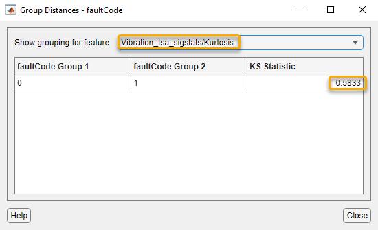
The KS Statistic in this case is about 0.6, reflecting the intermixing in the histogram.
Restore Bin Width to auto.
Rotating Machinery Features
Since you have rotating machinery, compute rotating machinery features. In the variables pane, select your TSA signal. Then, select Time-Domain Features > Rotating Machinery Features.
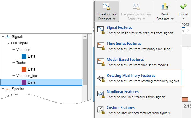
The Rotating Machinery Features tab can create features from TSA signals as well as from TSA difference signals and TSA regular signals. Since you have only a TSA signal, the app disables the selections that do require a different signal type.
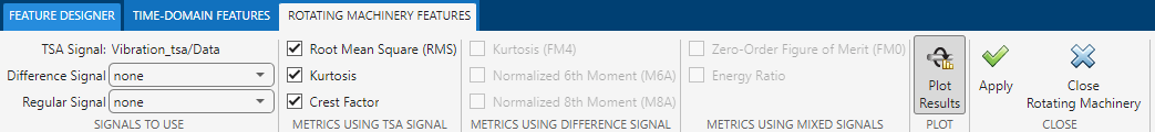
Accept the default selections by clicking Apply.
The app automatically adds the new features to the feature table
and the Select Features list, and plots the new histograms
at the top of the histogram display. CrestFactor and
Kurtosis histograms are essentially the same whether they
are computed as signal features or rotating machinery features, since both
computations use the TSA signal as a source.
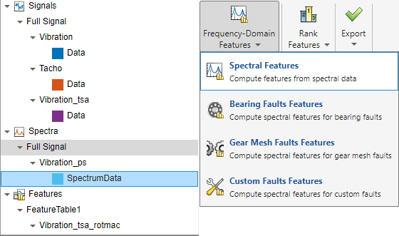
Spectral Features
Compute spectral features from the power spectrum you generated earlier.
Select Vibration_ps/SpectrumData. Then, select Frequency-Domain Features > Spectral Features.
Specify the frequency band to use by setting the minimum and maximum band
values. To capture the power spectrum peaks efficiently, limit the frequency
range to a maximum of 10 Hz, starting at
0.001 Hz. The plot displays this band as an orange
rectangle underlying the frequency plot.
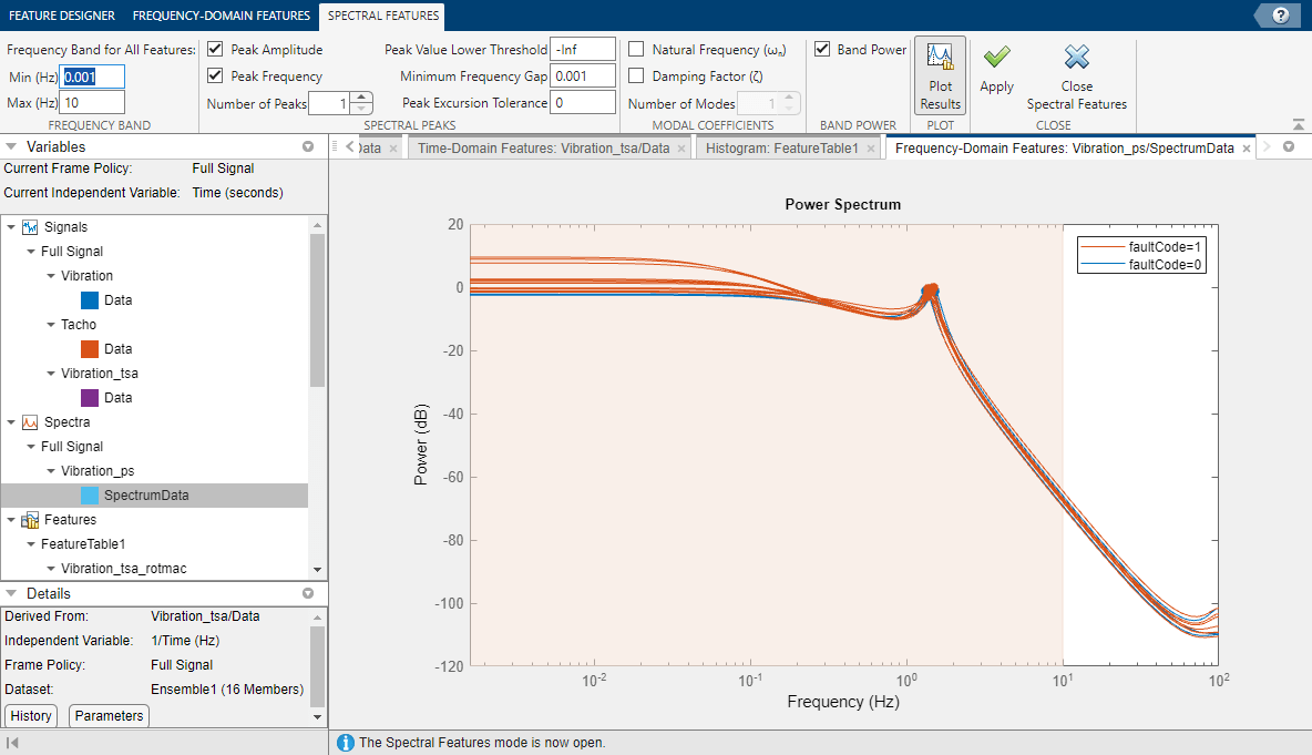
The histograms show substantial intermixing of healthy and unhealthy data in one or more of the bins for all three features.

You now have a diverse set of features.
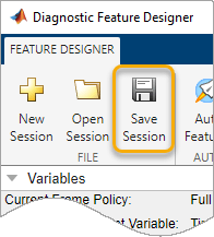
Save your session data. You need this data to run the Rank and Export Features in Diagnostic Feature Designer example.
Next Steps
The next step is to rank these features to determine which ones provide the best indication of system condition. For more information, see Rank and Export Features in Diagnostic Feature Designer.
See Also
Topics
- Open Diagnostic Feature Designer
- Rank and Export Features in Diagnostic Feature Designer
- Explore Ensemble Data and Compare Features Using Diagnostic Feature Designer
- Interpret Feature Histograms in Diagnostic Feature Designer
- Data Preprocessing for Condition Monitoring and Predictive Maintenance
- Condition Indicators for Monitoring, Fault Detection, and Prediction
- Condition Indicators for Gear Condition Monitoring