plot
timeseries のプロット
説明
plot( は、線グラフを使用して ts,LineSpec)timeseries データをプロットし、指定した specs をラインまたはマーカー、あるいはその両方に適用します。
また、名前と値の引数を指定して Line のプロパティ を定義することもできます。
p = plot(___) は Line オブジェクトまたは Line オブジェクトの配列を返します。プロットのプロパティを作成後に変更するには、p を使用します。プロパティの一覧については、Line のプロパティ を参照してください。
例
時系列オブジェクトを作成し、開始日を設定して、開始日に相対的に時間ベクトルをプロットします。
x = [2 5 8 2 11 3 6];
ts1 = timeseries(x,1:7);

ts1.Name = 'Daily Count';
ts1.TimeInfo.Units = 'days';
ts1.TimeInfo.StartDate = '01-Jan-2011';     % Set start date.
ts1.TimeInfo.Format = 'mmm dd, yy';       % Set format for display on x-axis.

ts1.Time = ts1.Time - ts1.Time(1);        % Express time relative to the start date.

plot(ts1)

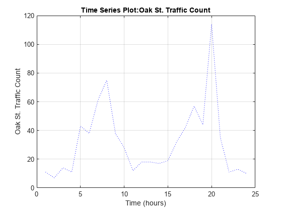
交通量の調査データから 2 つの時系列オブジェクトを作成し、同じ座標軸上に順番にプロットします。イベントを系列に追加すると、自動的に赤色のマーカーで表示されます。
load count.dat;
count1 = timeseries(count(:,1),1:24);
count1.Name = 'Oak St. Traffic Count';
count1.TimeInfo.Units = 'hours';
plot(count1,':b')
grid on
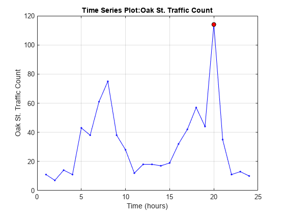
最大値の時間を取得してイベントとして追加します。
[~,index] = max(count1.Data);
max_event = tsdata.event('peak',count1.Time(index));
max_event.Units = 'hours';
このイベントを時系列に追加します。
count1 = addevent(count1,max_event);
イベントを表示する新しいプロットに、プロットを置き換えます。
plot(count1,'.-b')
grid on
同じデータ ソースの列 2 から新しい時系列オブジェクトを作成します。
count2 = timeseries(count(:,2),1:24);
count2.Name = 'Maple St. Traffic Count';
count2.TimeInfo.Units = 'hours';
ホールドをオンにして新しいデータをプロットに追加します。
hold onこのプロット メソッドはホールドされたプロットにラベルは追加しません。プロパティと値のペアを使用してマーカーをカスタマイズします。
plot(count2,'s-m','MarkerSize',6),
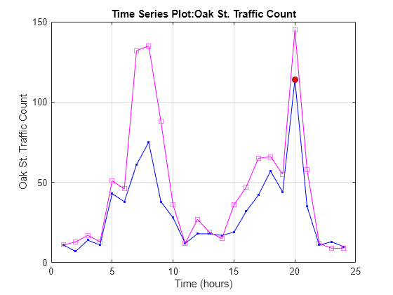
ラベルは消去されているため、手動でラベルを生成します。
title('Time Series: Oak Street and Maple Street')
xlabel('Hour of day')
ylabel('Vehicle count')
左上に凡例を追加します。
legend('Oak St.','Maple St.','Location','northwest')

入力引数
入力 timeseries。スカラーとして指定します。
ライン スタイル、マーカー、および色。記号を含む string スカラーまたは文字ベクトルとして指定します。記号は任意の順序で表記できます。3 つの特性 (ライン スタイル、マーカーおよび色) をすべて指定する必要はありません。たとえば、ライン スタイルを省略してマーカーを指定する場合、プロットはラインなしでマーカーのみを表示します。
例: "--or" は円形マーカー付きの赤い破線です。
| ライン スタイル | 説明 | 結果として得られる線 |
|---|---|---|
"-" | 実線 |
|
"--" | 破線 |
|
":" | 点線 |
|
"-." | 一点鎖線 |
|


| マーカー | 説明 | 結果のマーカー |
|---|---|---|
"o" | 円 |
|
"+" | プラス記号 |
|
"*" | アスタリスク |
|
"." | 点 |
|
"x" | 十字 |
|
"_" | 水平線 |
|
"|" | 垂直線 |
|
"square" | 正方形 |
|
"diamond" | 菱形 |
|
"^" | 上向き三角形 |
|
"v" | 下向き三角形 |
|
">" | 右向き三角形 |
|
"<" | 左向き三角形 |
|
"pentagram" | 星形五角形 |
|
"hexagram" | 星形六角形 |
|


| 色名 | 省略名 | RGB 3 成分 | 外観 |
|---|---|---|---|
"red" | "r" | [1 0 0] |
|
"green" | "g" | [0 1 0] |
|
"blue" | "b" | [0 0 1] |
|
"cyan" | "c" | [0 1 1] |
|
"magenta" | "m" | [1 0 1] |
|
"yellow" | "y" | [1 1 0] |
|
"black" | "k" | [0 0 0] |
|
"white" | "w" | [1 1 1] |
|


ヒント
関数
plotは、タイトルと軸のラベルを自動的に生成します。生成されるラベルは次のとおりです。プロットのタイトル —
'Time Series Plot: <name>'ここで、
<name>は、ts.Nameに割り当てられた文字列、または既定の設定で'unnamed'です。X 軸ラベル —
'Time (<units>)'ここで、
<units>は、ts.TimeInfo.Unitsフィールドの値 (既定は'seconds') です。Y 軸ラベル —
'<name>'ここで、
<name>は、ts.Nameに割り当てられた文字列、または既定の設定で'unnamed'です。
新しい時系列データは時系列プロットに配置できます (たとえば、
hold onを設定して、別のtimeseries/plotコマンドを実行します)。データをプロットに追加すると、ラベル作成時の混乱を避けるために、タイトルと座標軸ラベルが空白文字列になります。プロット後に独自のラベルを追加するには、titleコマンド、xlabelコマンド、およびylabelコマンドを使用します。時系列イベントが定義されている場合、赤色で塗りつぶされた円のマーカーを使用してプロットに印をつけます。データで定義されているイベント マーカー以外に、関数
linespecまたは名前と値の構文も使用すれば、すべてのデータ点のマーカーを指定できます。イベント マーカーは定義したマーカーの一番上にプロットされます。ts.DataInfo.Interpolation.Nameに割り当てられた値は、時系列データのプロットおよびリサンプリング時にplotメソッドで使用する内挿の種類を制御します。既定の線形内挿をゼロ次ホールド内挿 (階段型) に変更するには、timeseriesメソッドsetinterpmethodを呼び出します。このメソッドによって新しいtimeseriesオブジェクトが作成され、必要に応じて元のオブジェクトを上書きできます。たとえば、時系列tsがゼロ次ホールド内挿を使用するようにするには、以下のように入力します。ts = ts.setinterpmethod('zoh');
バージョン履歴
R2006a より前に導入