Interpret Feature Histograms in Diagnostic Feature Designer
A feature is effective when it clearly separates data groups with different condition variable labels. Diagnostic Feature Designer provides various feature options, but the most effective features depend on your data and the systems and conditions your data represents.
To perform a preliminary assessment of how effective a feature is, you can evaluate the feature histogram. The histogram plot visualizes the separation between labeled groups. To do so, the histogram bins the data distribution and uses color to identify the label groups within each bin. You can customize the histogram to enhance the visualization and highlight information in features of interest. You can also view numerical information about the separation between group distributions.
Histograms allow you to get an early sense of feature effectiveness. To perform a more rigorous quantitative assessment using specialized statistical methods, use ranking, as described in Rank Features in Explore Ensemble Data and Compare Features Using Diagnostic Feature Designer. The feature-ranking computations are independent of the visualization choices you make during histogram analysis.
The following figure shows separation visualization. These examples have a relatively small sample size, which exaggerates differences.

In both plots, the two-state condition code is faultCode. A value of 0
(blue) indicates a healthy system and a value of 1 (orange) indicates a faulty system. The
histograms represent the crest factor and the kurtosis of the Vibration
signal.
The crest factor histogram shows that:
All the healthy system feature values fall within the range of the first bin.
Most of the faulty system values fall into the remaining three bins.
The first bin also contains some data from the faulty system, but the amount is small relative to the healthy system data.
For this case, the histogram indicates that the crest factor feature distinguishes between healthy and faulty behavior well, but not completely.
By contrast, the kurtosis histogram shows that:
Data with values in the range of the first bin is always faulty.
Data within the range of the other bins come from both healthy and faulty groups. The fault state is ambiguous in these regions.
From these two histograms, you can infer that the crest factor feature is more effective than the kurtosis feature.
The app provides interactive tools for customizing the histogram. For example, you can increase the histogram resolution by changing bin width, changing the condition variable that specifies the groups, or modifying the normalization that the histogram applies. For more information on customizing histograms in the app, see Generate and Customize Feature Histograms.
Interpret Feature Histograms for Multiclass Condition Variables
If your condition variable has more than two states, or classes, the resulting
histograms might be harder to interpret on their own because of the additional color
combinations. For example, suppose that your fault code can represent two independent fault
states in addition to the healthy state, fault1 and
fault2. The following figure shows histograms similar to the previous
histograms but corresponding to such a three-class condition variable.

Get additional information on feature effectiveness by viewing numerical group distances. The Show Group Distance option provides a value, the KS statistic, for each combination of condition variable classes. Using the two-sample Kolmogorov-Smirnov test, the KS statistic indicates how well separated the cumulative distribution functions of the distributions of the two classes are.
The following table shows the group distances corresponding to the previous histograms.


The KS statistic indicates the separation between every pairing of the
faultCode values. The statistic value ranges from 0 to 1, where 0 is no
separation between the distributions, and 1 is complete separation.
For the crest factor feature as with the two-class faultCode,
differentiation between healthy fault0 and faulty
fault1 data is strong, with a KS statistic of 1. Differentiation is
also strong between fault1 and fault2 data. However,
differentiation between fault0 and fault2 data is
relatively poor.
For the kurtosis feature, differentiation between pairs in all pairings is relatively poor.
For more information on the KS statistic, see kstest2.
Generate and Customize Feature Histograms
To generate a set of feature histograms from a feature table:
Select the feature table in the Feature Tables section of the data browser.
Click the Histogram icon in the plot gallery.
To optimize separation visualization, customize the histograms. The Histogram tab provides parameters that allow you to modify the histogram to enhance interpretation.
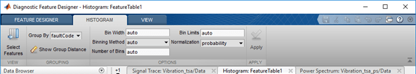
Select Features
By default, the app plots histograms for all your features, and displays them in reverse-alphabetical order. If you want to focus on a smaller set of features, click Select Features.
Group Data by a Condition Variable
You can group data in the histogram set for any condition variable you have imported. This condition variable might indicate system health. The variable might also be an operational condition such as temperature or machine mode. To select a condition variable to group by color code, select a variable from Group By.
Display the Group Separation Distance
To display the group separation distance, or KS Statistic, that was discussed in Interpret Feature Histograms for Multiclass Condition Variables, click Show Group Distance. This option brings up a table providing the group separation value for each pairing of condition variable values. In the window, choose which feature you want to examine.
Modify the Bin Settings
By default, the app determines the bin size automatically. Override the automation by typing a different value for bin width or selecting an alternate binning method. The bin settings apply to all the histograms for the feature table.

The bin settings for bin width, binning method, and number of bins are not independent. The algorithm uses an order of precedence to determine what to use:
The Binning Method is the default driver for the bin width.
A Bin Width specification overrides the Binning Method.
The bin width and the independent Bin Limits drive the number of bins. A Number of Bins specification has an effect only when there is no data grouping.
Modify the Binning Algorithm
By default, Diagnostic Feature Designer uses an automatic binning algorithm that returns bins with a uniform bin width. The algorithm chooses the bin settings to cover the data range and reveal the underlying shape of the distribution. To change the binning algorithm, choose from the Binning Method menu.
For information on the binning algorithms, see the ‘BinMethod’
description in histogram.
Increase Resolution by Specifying Bin Width
Increase the resolution of your data by specifying a width that is narrower than what
the ‘auto’ setting provides for the feature you are examining.
For example, the following figure repeats the earlier histograms showing separation of
data for two fault code values and two features. For the crest factor, the first bin has
intermixed healthy and degraded data.
The bin width for the Crest Factor feature is 0.1. If you decrease the bin width to 0.05, the histogram changes as shown here.

Now the healthy crest factor data is isolated to the first bin, and the remaining bins contain only unhealthy data. However, you have lost resolution on the kurtosis histogram, because a specified bin width applies to all features.
Exclude Outlying Data by Changing Bin Limits
If you are interested in only a portion of the feature distribution, use Bin
Limits to exclude data outside of the area of interest. Enter the desired
limits in the form [lower upper]. This selection does not affect the KS
statistic calculation in the group distance table.
Change the Normalization Method
The default histograms use probability for the y axis, with a corresponding range from 0 to 1 for all features. Viewing multiple histograms on the same scale makes it easier to visually compare them. Choose other axis settings from the Normalization menu. These methods include raw counts and statistical metrics such as CDF.
See Also
Diagnostic Feature
Designer | histogram | kstest2