Model and Simulate Electricity Spot Prices Using the Skew-Normal Distribution
This example shows how to simulate the future behavior of electricity spot prices from a time series model fitted to historical data. Because electricity spot prices can exhibit large deviations, the example models the innovations using a skew-normal distribution. The data set in this example contains simulated, daily electricity spot prices from January 1, 2010 through November 11, 2013.
Model and Analysis Overview
The price of electricity is associated with the corresponding demand [1]. Changes to population size and technological advancements suggest that electricity spot prices have a long-term trend. Also, given the climate of a region, the demand for electricity fluctuates according to the season. Consequently, electricity spot prices fluctuate similarly, suggesting the inclusion of a seasonal component in the model.
During periods of high demand, spot prices can exhibit jumps when technicians supplement the current supply with power generated from less efficient methods. These periods of high demand suggest that the innovations distribution of the electricity spot prices is right skewed rather than symmetric.
The characteristics of electricity spot prices influence the steps for model creation:
Determine whether the spot price series has exponential, long-term deterministic, and seasonal trends by inspecting its time series plot and performing other statistical tests.
If the spot price series exhibits an exponential trend, remove it by applying the log transform to the data.
Assess whether the data has a long-term deterministic trend. Identify the linear component using linear regression. Identify the dominant seasonal components by applying spectral analysis to the data.
Perform stepwise linear regression to estimate the overall long-term deterministic trend. The resulting trend comprises linear and seasonal components with frequencies determined by the spectral analysis. Detrend the series by removing the estimated long-term deterministic trend from the data.
Specify and estimate an appropriate autoregressive, moving average (ARIMA) model for the detrended data by applying the Box-Jenkins methodology.
Fit a skew-normal probability distribution to the standardized residuals of the fitted ARIMA model. This step requires a custom probability distribution object created using the framework available in Statistics and Machine Learning Toolbox™.
Simulate spot prices. First, draw an iid random standardized residual series from the fitted probability distribution from step 6. Then, backtransform the simulated residuals by reversing steps 1–5.
Load and Visualize Electricity Spot Prices
Load the Data_ElectricityPrices MAT-file included with Econometrics Toolbox™. The data consists of a 1411-by-1 timetable DataTimeTable containing daily electricity spot prices.
load Data_ElectricityPrices
T = size(DataTimeTable,1); % Sample size
The workspace contains the 1411-by-1 MATLAB® timetable DataTimeTable of daily electricity spot prices, among other variables.
Determine whether the data contains trends by plotting the spot prices over time.
figure
plot(DataTimeTable.Date, DataTimeTable.SpotPrice)
xlabel('Date')
ylabel('Spot price ($)')
title('Daily Electricity Prices')
grid on
axis tight
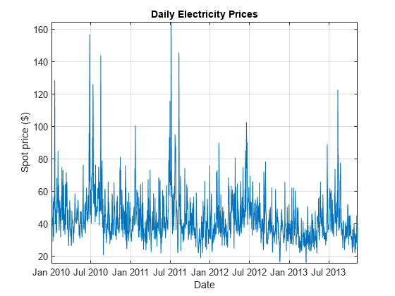
The spot prices exhibit:
Large spikes, which are likely caused by periods of high demand
A seasonal pattern, which is likely caused by seasonal fluctuations in demand
A slight downward trend
The presence of an exponential trend is difficult to determine from the plot.
Assess and Remove Exponential Trend
Assess the presence of an exponential trend by computing monthly statistics. If the spot price series exhibits an exponential trend, then the means and standard deviations, computed over constant time periods, lie on a line with a significant slope.
Estimate the monthly means and standard deviations of the series.
statsfun = @(v) [mean(v) std(v)];
MonthlyStats = retime(DataTimeTable,'monthly',statsfun);
Plot the monthly standard deviations over the means. Add a line of best fit to the plot.
figure
scatter(MonthlyStats.SpotPrice(:, 1),...
        MonthlyStats.SpotPrice(:, 2),'filled')
h = lsline;
h.LineWidth = 2.5;
h.Color = 'r';
xlabel('Mean ($)')
ylabel('Standard deviation ($)')
title('Monthly Price Statistics')
grid on
Perform a test for the significance of the linear correlation. Include the results in the legend.
[rho, p] = corr(MonthlyStats.SpotPrice);
legend({'(\mu, \sigma)', ...
    ['Line of best fit (\rho = ',num2str(rho(1, 2),'%0.3g'),...
    ', {\it p}-value: ',num2str(p(1, 2),'%0.3g'),')']},...
    'Location','northwest')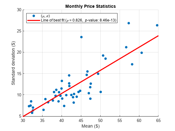
The p-value is close to 0, suggesting that the monthly statistics are significantly positively correlated. This result provides evidence of an exponential trend in the spot price series.
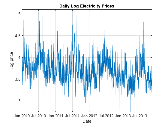
Remove the exponential trend by applying the log transform to the series.
DataTimeTable.LogPrice = log(DataTimeTable.SpotPrice);
Plot the log prices over time.
figure
plot(DataTimeTable.Date,DataTimeTable.LogPrice)
xlabel('Date')
ylabel('Log price')
title('Daily Log Electricity Prices')
grid on
axis tight
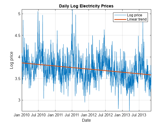
Assess Long-Term Deterministic Trend
Because the plot of the spot prices slopes downward and has a seasonal pattern, the long-term trend can contain linear and seasonal components. To estimate the linear component of the trend:
ElapsedYears = years(DataTimeTable.Date - DataTimeTable.Date(1)); % Number of elapsed years
DataTimeTable = addvars(DataTimeTable,ElapsedYears,'Before',1);   % ElapsedYears is first variable in DataTimeTable

lccoeffs = polyfit(DataTimeTable.ElapsedYears,DataTimeTable.LogPrice,1);
DataTimeTable.LinearTrend = polyval(lccoeffs,DataTimeTable.ElapsedYears);
Plot the linear component of the trend over the log spot prices.
hold on
plot(DataTimeTable.Date,DataTimeTable.LinearTrend,'LineWidth',2)
legend({'Log price' 'Linear trend'})
Identify seasonal components of the long-term trend by performing a spectral analysis of the data. Start the analysis by performing these actions:
Remove the linear trend from the log spot prices.
Apply the Fourier transform to the result.
Compute the power spectrum of the transformed data and the corresponding frequency vector.
DataTimeTable.LinearDetrendedLogPrice = DataTimeTable.LogPrice - DataTimeTable.LinearTrend;
fftLogPrice = fft(DataTimeTable.LinearDetrendedLogPrice);

powerLogPrice = fftLogPrice.*conj(fftLogPrice)/T; % Power spectrum
freq = (0:T - 1)*(1/T);                           % Frequency vector
Because the spectrum of a real-valued signal is symmetric about the middle frequency, remove the latter half of the observations from the power and frequency data.
m = ceil(T/2);
powerLogPrice = powerLogPrice(1:m);
freq = freq(1:m);
Convert the frequencies to periods. Because the observations are measured daily, divide the periods by 365.25 to express them in years.
periods = 1./freq/365.25;
Identify the two periods that have the largest powers.
[maxPowers,posMax] = maxk(powerLogPrice,2);
topPeriods = periods(posMax);

figure;
stem(periods,powerLogPrice,'.')
xlabel('Period (years)')
ylabel('Power')
title('Power Spectrum of Daily Log Electricity Prices')
hold on
plot(periods(posMax),maxPowers,'r^','MarkerFaceColor','r')
grid on
legend({'Power','Maxima'})
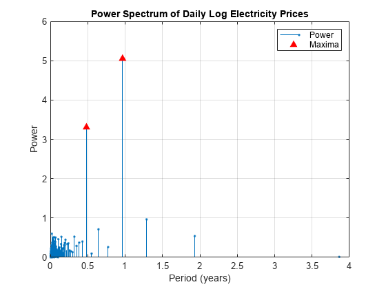
The dominant seasonal components correspond to 6-month and 12-month cycles.
Fit Long-Term Deterministic Trend Model
By combining the dominant seasonal components, estimated by the spectral analysis, with the linear component, estimated by least squares, a linear model for the log spot prices can have this form:
where:
is years elapsed from the start of the sample.
is an iid sequence of random variables.
and are the coefficients of the annual components.
and are the coefficients of the semiannual components.
The sine and cosine terms in the model account for a possible phase offset. That is, for a phase offset :
,
where and are constants. Therefore, the inclusion of sine and cosine terms with the same frequency accounts for a phase offset.
Form the design matrix. Because the software includes a constant term in the model by default, do not include a column of ones in the design matrix.
designMat = @(t) [t sin(2*pi*t) cos(2*pi*t) sin(4*pi*t) cos(4*pi*t)];
X = designMat(DataTimeTable.ElapsedYears);
Fit the model to the log spot prices. Apply stepwise regression to select the important predictors.
varNames = {'t' 'sin(2*pi*t)' 'cos(2*pi*t)'...
            'sin(4*pi*t)' 'cos(4*pi*t)' 'LogPrice'};
TrendMdl = stepwiselm(X,DataTimeTable.LogPrice,'Upper','linear','VarNames',varNames);
1. Adding t, FStat = 109.7667, pValue = 8.737506e-25 2. Adding cos(2*pi*t), FStat = 135.2363, pValue = 6.500039e-30 3. Adding cos(4*pi*t), FStat = 98.0171, pValue = 2.19294e-22 4. Adding sin(4*pi*t), FStat = 22.6328, pValue = 2.16294e-06
disp(TrendMdl)
Linear regression model:
    LogPrice ~ 1 + t + cos(2*pi*t) + sin(4*pi*t) + cos(4*pi*t)

Estimated Coefficients:
                   Estimate        SE         tStat       pValue
                   _________    _________    _______    __________

    (Intercept)       3.8617     0.014114      273.6             0
    t              -0.073594    0.0063478    -11.594    9.5312e-30
    cos(2*pi*t)     -0.11982     0.010116    -11.845    6.4192e-31
    sin(4*pi*t)     0.047563    0.0099977     4.7574    2.1629e-06
    cos(4*pi*t)     0.098425    0.0099653     9.8768    2.7356e-22


Number of observations: 1411, Error degrees of freedom: 1406
Root Mean Squared Error: 0.264
R-squared: 0.221,  Adjusted R-Squared: 0.219
F-statistic vs. constant model: 99.9, p-value = 7.15e-75
stepwiselm drops the term from the linear model, indicating that the annual cycle begins at a wave peak.
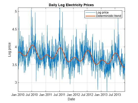
Plot the fitted model.
DataTimeTable.DeterministicTrend = TrendMdl.Fitted;

figure
plot(DataTimeTable.Date,DataTimeTable.LogPrice)
xlabel('Date')
ylabel('Log price')
title('Daily Log Electricity Prices')
grid on
hold on
plot(DataTimeTable.Date,DataTimeTable.DeterministicTrend,'LineWidth',2)
legend({'Log price','Deterministic trend'})
axis tight
hold off
Analyze Detrended Data
Form a detrended time series by removing the estimated long-term deterministic trend from the log spot prices. In other words, extract the residuals from the fitted stepwise linear regression model.
DataTimeTable.DetrendedLogPrice = TrendMdl.Residuals.Raw;
Plot the detrended data over time.
figure
plot(DataTimeTable.Date,DataTimeTable.DetrendedLogPrice)
xlabel('Date')
ylabel('Residual')
title('Trend Model Residuals')
grid on
axis tight
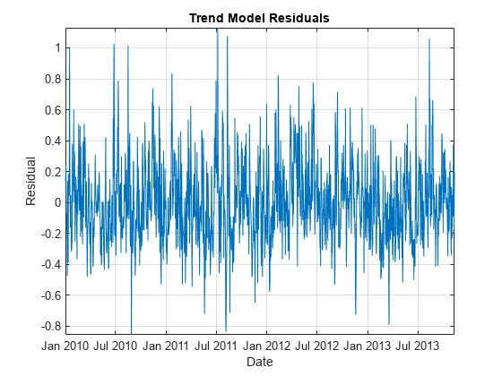
The detrended data appears centered at zero, and the series exhibits serial autocorrelation because several clusters of consecutive residuals occur above and below . These features suggest that an autoregressive model is appropriate for the detrended data.
To determine the number of lags to include in the autoregressive model, apply the Box-Jenkins methodology. Plot the autocorrelation function (ACF) and partial autocorrelation function (PACF) of the detrended data in the same figure, but on separate plots. Examine the first 50 lags.
numLags = 50;

figure
subplot(2,1,1)
autocorr(DataTimeTable.DetrendedLogPrice,'NumLags',numLags)
subplot(2,1,2)
parcorr(DataTimeTable.DetrendedLogPrice,'NumLag',numLags)
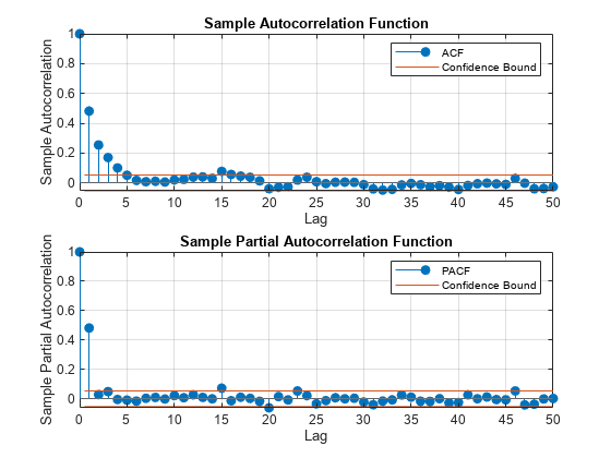
The ACF gradually decays. The PACF exhibits a sharp cutoff after the first lag. This behavior is indicative of an AR(1) process with the form
,
where is the lag 1 autoregressive coefficient and is an iid sequence of random variables. Because the detrended data is centered around zero, the model constant is 0.
Create an AR(1) model for the detrended data without a model constant.
DTMdl = arima('Constant',0,'ARLags',1);
disp(DTMdl)
  arima with properties:

     Description: "ARIMA(1,0,0) Model (Gaussian Distribution)"
      SeriesName: "Y"
    Distribution: Name = "Gaussian"
               P: 1
               D: 0
               Q: 0
        Constant: 0
              AR: {NaN} at lag [1]
             SAR: {}
              MA: {}
             SMA: {}
     Seasonality: 0
            Beta: [1×0]
        Variance: NaN
DTMdl is an arima model object representing an AR(1) model and serving as a template for estimation. Properties of DTMdl with the value NaN correspond to estimable parameters in the AR(1) model.
Fit the AR(1) model to the detrended data.
EstDTMdl = estimate(DTMdl,DataTimeTable.DetrendedLogPrice);
    ARIMA(1,0,0) Model (Gaussian Distribution):

                 Value      StandardError    TStatistic      PValue
                ________    _____________    __________    ___________

    Constant           0              0           NaN              NaN
    AR{1}         0.4818       0.024353        19.784       4.0787e-87
    Variance    0.053497      0.0014532        36.812      1.1867e-296
estimate fits all estimable parameters in DTMdl to the data, then returns EstDTMdl, an arima model object representing the fitted AR(1) model.
Infer residuals and the conditional variance from the fitted AR(1) model.
[DataTimeTable.Residuals,condVar] = infer(EstDTMdl,DataTimeTable.DetrendedLogPrice);
condVar is a T-by-1 vector of conditional variances for each time point. Because the specified ARIMA model is homoscedastic, all elements of condVar are equal.
Standardize the residuals by dividing each residual by the instantaneous standard deviation.
DataTimeTable.StandardizedResiduals = DataTimeTable.Residuals./sqrt(condVar);
Plot the standardized residuals and verify that the residuals are not autocorrelated by plotting their ACF to 50 lags.
figure
subplot(2,1,1)
plot(DataTimeTable.Date,DataTimeTable.StandardizedResiduals)
xlabel('Date')
ylabel('Residual')
title('Standardized Residuals')
grid on
axis tight
subplot(2,1,2)
autocorr(DataTimeTable.StandardizedResiduals,'NumLags',numLags)
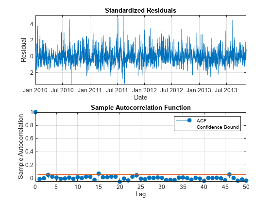
The residuals do not exhibit autocorrelation.
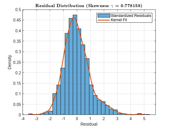
Plot a histogram of the standardized residuals and overlay a nonparametric kernel fit.
kernelFit = fitdist(DataTimeTable.StandardizedResiduals,'kernel');
sampleRes = linspace(min(DataTimeTable.StandardizedResiduals),...
    max(DataTimeTable.StandardizedResiduals),500).';
kernelPDF = pdf(kernelFit,sampleRes);

figure
histogram(DataTimeTable.StandardizedResiduals,'Normalization','pdf')
xlabel('Residual')
ylabel('Density')
s = skewness(DataTimeTable.StandardizedResiduals);
title(sprintf('\\bf Residual Distribution (Skewness $\\gamma$ = %4f)',s),'Interpreter','latex')
grid on
hold on
plot(sampleRes,kernelPDF,'LineWidth',2)
legend({'Standardized Residuals','Kernel Fit'})
hold off
Create a normal probability plot of the standardized residuals.
figure
probplot(DataTimeTable.StandardizedResiduals)
grid on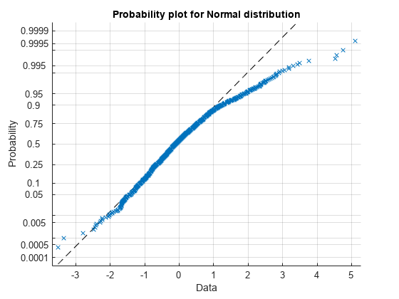
The residuals exhibit positive skewness because they deviate from normality in the upper tail.
Model Skewed Residual Series
The epsilon-skew-normal distribution is a near-normal distribution family with location , scale , and additional skewness parameter . The skewness parameter models any nonzero skewness in the data [2]. If , the epsilon-skew-normal distribution reduces to the normal distribution.
Open this example to access the custom distribution object representing the epsilon-skew-normal distribution. To create your own custom distribution object, follow these steps:
Open the Distribution Fitter app (Statistics and Machine Learning Toolbox™) by entering
distributionFitterat the command line.In the app, select File > Define Custom Distributions. The Editor displays a class-definition file containing a sample of a custom distribution class (the Laplace distribution). Close the Define Custom Distributions window and the Distribution Fitter window.
In the sample class-definition file, change the class name from
LaplaceDistributiontoEpsilonSkewNormal.In your current folder, create a directory named
+prob, then save the new class-definition file in that folder.In the class-definition file, enter epsilon-skew-normal distribution parameters as properties, and adjust the methods so that the class represents the epsilon-skew-normal distribution. For details on the distribution, see [2].
To ensure that the probability distribution framework recognizes the new distribution, reset its distribution list.
makedist -resetBecause the residuals of the model for the detrended data appear positively skewed, fit an epsilon-skew-normal distribution to the residuals by using maximum likelihood.
ResDist = fitdist(DataTimeTable.StandardizedResiduals,'EpsilonSkewNormal');
disp(ResDist)
EpsilonSkewNormalDistribution
EpsilonSkewNormal distribution
theta = -0.421946 [2.22507e-308, -0.296901]
sigma = 0.972487 [0.902701, 1.04227]
epsilon = -0.286248 [2.22507e-308, -0.212011]
The estimated skewness parameter is approximately -0.286, indicating that the residuals are positively skewed.
Display the estimated standard errors of the parameter estimates.
stdErr = sqrt(diag(ResDist.ParameterCovariance));
SETbl = table(ResDist.ParameterNames',stdErr,...
    'VariableNames',{'Parameter', 'StandardError'});

disp('Estimated parameter standard errors:')
Estimated parameter standard errors:
disp(SETbl)
     Parameter     StandardError
    ___________    _____________

    {'theta'  }        0.0638
    {'sigma'  }      0.035606
    {'epsilon'}      0.037877
has a small standard error (~0.038), indicating that the skewness is significant.
Plot a histogram of the residuals and overlay the fitted distribution.
fitVals = pdf(ResDist,sampleRes);

figure
histogram(DataTimeTable.StandardizedResiduals,'Normalization','pdf')
xlabel('Residual')
ylabel('Density')
title('Residual Distribution')
grid on
hold on
plot(sampleRes,fitVals,'LineWidth',2)
legend({'Residuals','Epsilon-Skew-Normal Fit'})
hold off
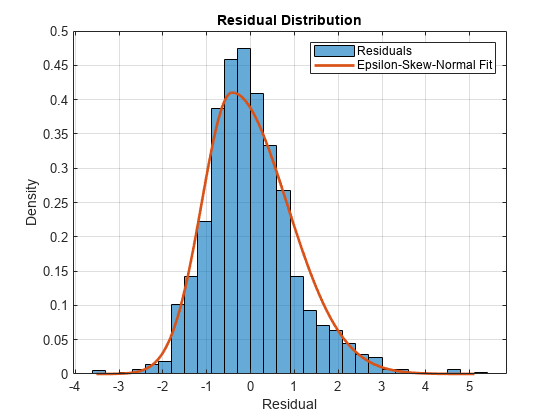
The fitted distribution appears to be a good model for the residuals.
Assess Goodness of Fit
Assess the goodness of fit of the epsilon-skew-normal distribution by following this procedure:
Compare the empirical and fitted (reference) cumulative distribution functions (cdfs).
Conduct the Kolmogorov-Smirnov test for goodness of fit.
Plot the maximum cdf discrepancy.
Compute the empirical cdf of the standardized residuals and the cdf of the fitted epsilon-skew-normal distribution. Return the points at which the software evaluates the empirical cdf.
[resCDF,queryRes] = ecdf(DataTimeTable.StandardizedResiduals);
fitCDF = cdf(ResDist,sampleRes);
Plot the empirical and fitted cdfs in the same figure.
figure
stairs(queryRes,resCDF,'LineWidth', 1.5)
hold on
plot(sampleRes,fitCDF,'LineWidth', 1.5)
xlabel('Residual')
ylabel('Cumulative probability')
title('Empirical and Fitted CDFs (Standardized Residuals)')
grid on
legend({'Empirical CDF','Epsilon-Skew-Normal CDF'},...
        'Location','southeast')
The empirical and reference cdfs appear similar.
Conduct the Kolmogorov-Smirnov test for goodness of fit by following this procedure:
If the data that includes the empirical cdf is the same set as the data that includes the reference cdf, then the Kolmogorov-Smirnov test is invalid. Therefore, partition the data set into training and test sets by using the Statistics and Machine Learning Toolbox™ cross-validation partition tools.
Fit the distribution to the training set.
Validate the fit on the test set.
rng default                          % For reproducibility
cvp = cvpartition(T,'HoldOut',0.20); % Define data partition on T observations
idxtraining = training(cvp);         % Extract training set indices
idxtest = test(cvp);                 % Extract test set indices

trainingset = DataTimeTable.StandardizedResiduals(idxtraining);
testset = DataTimeTable.StandardizedResiduals(idxtest);
resFitTrain = fitdist(trainingset,'EpsilonSkewNormal');     % Reference distribution

[~,kspval] = kstest(testset,'CDF',resFitTrain);
disp(['Kolmogorov-Smirnov test p-value: ',num2str(kspval)])
Kolmogorov-Smirnov test p-value: 0.85439
The p-value of the test is large enough to suggest that the null hypothesis that the distributions are the same should not be rejected.
Plot the maximum cdf discrepancy.
fitCDF = cdf(ResDist,queryRes);  % Fitted cdf with respect to empirical cdf query points
[maxDiscrep,maxPos] = max(abs(resCDF - fitCDF));
resAtMaxDiff = queryRes(maxPos);
plot(resAtMaxDiff*ones(1, 2),...
    [resCDF(maxPos) fitCDF(maxPos)],'k','LineWidth',2,...
    'DisplayName',['Maximum Discrepancy (%): ',num2str(100*maxDiscrep,'%.2f')])
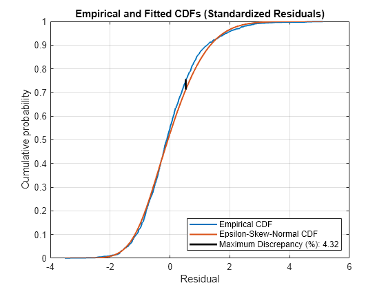
The maximum discrepancy is small, suggesting that the standardized residuals follow the specified epsilon-skew-normal distribution.
Simulate Future Electricity Spot Prices
Simulate future electricity spot prices over the two-year horizon following the end of the historical data. Construct a model from which to simulate, composed of the estimated components of the time series, by following this procedure:
Specify the dates for the forecast horizon.
Obtain simulated residuals by simulating standardized residuals from the fitted epsilon-skew-normal distribution, then scaling the result by the estimated instantaneous standard deviations.
Obtain simulated, detrended log prices by filtering the residuals through the fitted AR(1) model.
Forecast values of the deterministic trend using the fitted model.
Obtain simulated log prices by combining the simulated, detrended log prices and the forecasted, deterministic trend values.
Obtain simulated spot prices by exponentiating the simulated log spot prices.
Store the simulation data in a timetable named SimTbl.
numSteps = 2 * 365;
Date = DataTimeTable.Date(end) + days(1:numSteps).';
SimTbl = timetable(Date);
Simulate 1000 Monte Carlo paths of standardized residuals from the fitted epsilon-skew-normal distribution ResDist.
numPaths = 1000;
SimTbl.StandardizedResiduals = random(ResDist,[numSteps numPaths]);
SimTbl.StandardizedResiduals is a numSteps-by-numPaths matrix of simulated standardized residual paths. Rows correspond to periods in the forecast horizon, and columns correspond to separate simulation paths.
Simulate 1000 paths of detrended log prices by filtering the simulated, standardized residuals through the estimated AR(1) model EstDTMdl. Specify the estimated conditional variances condVar as presample conditional variances, the observed detrended log prices in DataTimeTable as presample responses, and the estimated standardized residuals in DataTimeTable as the presample disturbances. In this context, the "presample" is the period before the forecast horizon.
SimTbl.DetrendedLogPrice = filter(EstDTMdl,SimTbl.StandardizedResiduals, ...
    'Y0', DataTimeTable.DetrendedLogPrice,'V0',condVar,...
    'Z0', DataTimeTable.StandardizedResiduals);
SimTbl.DetrendedLogPrice is a matrix of detrended log prices with the same dimensions as SimTbl.StandardizedResiduals.
Forecast the long-term deterministic trend by evaluating the estimated linear model TrendMdl at the number of years elapsed since the beginning of the sample.
SimTbl.ElapsedYears = years(SimTbl.Date - DataTimeTable.Date(1));
SimTbl.DeterministicTrend = predict(TrendMdl, designMat(SimTbl.ElapsedYears));
SimTbl.DeterministicTrend is the long-term deterministic trend component of the log spot prices in the forecast horizon.
Simulate the spot prices by backtransforming the simulated values. That is, combine the forecasted long-term deterministic trend and the simulated log spot prices, then exponentiate the sum.
SimTbl.LogPrice = SimTbl.DetrendedLogPrice + SimTbl.DeterministicTrend;
SimTbl.SpotPrice = exp(SimTbl.LogPrice);
SimTbl.SpotPrice is a matrix of simulated spot price paths with the same dimensions as SimTbl.StandardizedResiduals.
Analyze Simulated Paths
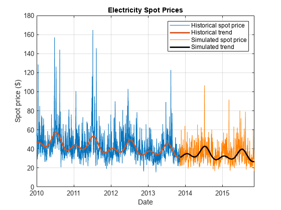
Plot a representative simulated path. A representative path is the path that has a final value nearest to the median final value among all paths.
Extract the simulated values at the end of the forecast horizon, then identify the path that is nearest to the median of the final values.
finalValues = SimTbl.SpotPrice(end, :);
[~,pathInd] = min(abs(finalValues - median(finalValues)));
Plot the historical data and deterministic trend, and the chosen simulated path and forecasted deterministic trend.
figure
plot(DataTimeTable.Date,DataTimeTable.SpotPrice)
hold on
plot(DataTimeTable.Date,exp(DataTimeTable.DeterministicTrend),'LineWidth',2)
plot(SimTbl.Date,SimTbl.SpotPrice(:,pathInd),'Color',[1, 0.5, 0])
plot(SimTbl.Date,exp(SimTbl.DeterministicTrend),'k','LineWidth', 2)
xlabel('Date')
ylabel('Spot price ($)')
title('Electricity Spot Prices')
legend({'Historical spot price','Historical trend',...
    'Simulated spot price','Simulated trend'})
grid on
hold off
Obtain Monte Carlo statistics from the simulated spot price paths by computing, for each time point in the forecast horizon, the mean and median, and the 2.5th, 5th, 25th, 75th, 95th, and 97.5th percentiles.
SimTbl.MCMean = mean(SimTbl.SpotPrice,2);
SimTbl.MCQuantiles = quantile(SimTbl.SpotPrice,[0.025 0.05 0.25 0.5 0.75 0.95 0.975],2);
Plot the historical spot prices and deterministic trend, all forecasted paths, the Monte Carlo statistics, and the forecasted deterministic trend.
figure
hHSP = plot(DataTimeTable.Date,DataTimeTable.SpotPrice);
hold on
hHDT = plot(DataTimeTable.Date,exp(DataTimeTable.DeterministicTrend),'LineWidth', 2);
hFSP = plot(SimTbl.Date,SimTbl.SpotPrice,'Color',[0.9,0.9,0.9]);
hFDT = plot(SimTbl.Date,exp(SimTbl.DeterministicTrend),'y','LineWidth', 2);
hFQ = plot(SimTbl.Date,SimTbl.MCQuantiles,'Color',[0.7 0.7 0.7]);
hFM = plot(SimTbl.Date,SimTbl.MCMean,'r--');
xlabel('Date')
ylabel('Spot price ($)')
title('Electricity Spot Prices')
h = [hHSP hHDT hFSP(1) hFDT hFQ(1) hFM];
legend(h,{'Historical spot price','Historical trend','Forecasted paths',...
    'Forecasted trend','Monte Carlo quantiles','Monte Carlo mean'})
grid on
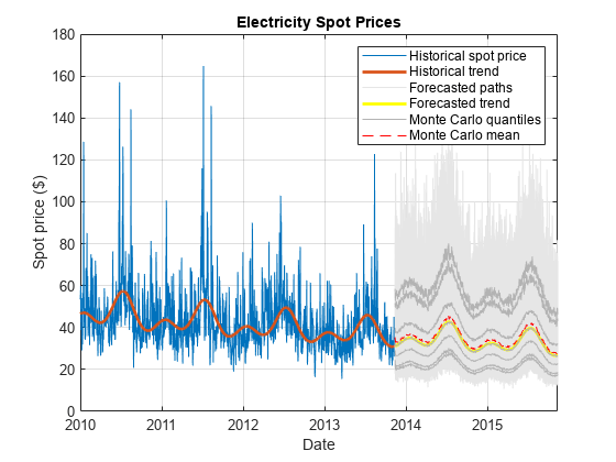
Alternatively, if you have a Financial Toolbox™ license, you can use fanplot to plot the Monte Carlo quantiles.
Assess whether the model addresses the large spikes exhibited in the historical data by following this procedure:
Estimate the monthly Monte Carlo moments of the simulated spot price paths.
Plot a line of best fit to the historical monthly moments.
Plot a line of best fit to the combined historical and Monte Carlo moments.
Visually compare the lines of best fit.
Compute monthly Monte Carlo means and standard deviations of the simulated spot price paths.
SimSpotPrice = timetable(SimTbl.Date, SimTbl.SpotPrice(:, end),...
    'VariableNames',{'SpotPrice'});
SimMonthlyStats = retime(SimSpotPrice,'monthly',statsfun);
Plot the historical monthly moments and their line of best fit. Overlay the Monte Carlo moments.
figure
hHMS = scatter(MonthlyStats.SpotPrice(:, 1),...
        MonthlyStats.SpotPrice(:, 2),'filled');
hHL = lsline;
hHL.LineWidth = 2.5;
hHL.Color = hHMS.CData;
hold on
scatter(SimMonthlyStats.SpotPrice(:, 1),...
        SimMonthlyStats.SpotPrice(:, 2),'filled');
Estimate and plot the overall line of best fit.
mmn = [MonthlyStats.SpotPrice(:, 1); SimMonthlyStats.SpotPrice(:, 1)];
msd = [MonthlyStats.SpotPrice(:, 2); SimMonthlyStats.SpotPrice(:, 2)];
p = polyfit(mmn,msd,1);
overallTrend = polyval(p,mmn);
plot(mmn,overallTrend,'k','LineWidth',2.5)
xlabel('Monthly mean price ($)')
ylabel('Monthly price standard deviation ($)')
title('Monthly Price Statistics')
legend({'Historical moments','Historical trend',...
    'Simulated moments','Overall trend'},'Location','northwest')
grid on
hold off
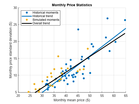
The simulated monthly moments are broadly consistent with the historical data. The simulated spot prices tend to exhibit smaller spikes than the observed spot prices. To account for larger spikes, you can model a larger right tail by applying extreme value theory in the distribution fitting step. This approach uses an epsilon-skew-normal distribution for the residuals, but models the upper tail by using the generalized Pareto distribution. For more details, see Using Extreme Value Theory and Copulas to Evaluate Market Risk.
Compare Epsilon-Skew-Normal Results with Normal Distribution Assumption
In the previous analysis, the standardized residuals derive from the fitted epsilon-skew-normal distribution. Obtain simulated spot prices by backtransforming normally distributed, standardized residuals. You can simulate the standardized residuals directly by using the simulate function of arima model objects. Store the time series components in a table named SimNormTbl.
SimNormTbl = timetable(Date);
SimNormTbl.ElapsedYears = SimTbl.ElapsedYears;

SimNormTbl.DeterministicTrend = SimTbl.DeterministicTrend;

SimNormTbl.DetrendedLogPrice = simulate(EstDTMdl,numSteps,'NumPaths',numPaths,...
    'E0',DataTimeTable.Residuals,'V0',condVar,'Y0',DataTimeTable.DetrendedLogPrice);
SimNormTbl.LogPrice = SimNormTbl.DetrendedLogPrice + SimNormTbl.DeterministicTrend;
SimNormTbl.SpotPrice = exp(SimNormTbl.LogPrice);
Obtain Monte Carlo statistics from the simulated spot price paths by computing, for each time point in the forecast horizon, the mean and median, and the 2.5th, 5th, 25th, 75th, 95th, and 97.5th percentiles.
SimNormTbl.MCMean = mean(SimNormTbl.SpotPrice,2);
SimNormTbl.MCQuantiles = quantile(SimNormTbl.SpotPrice,[0.025 0.05 0.25 0.5 0.75 0.95 0.975],2);
Plot the historical spot prices and deterministic trend, all forecasted paths, the Monte Carlo statistics, and the forecasted deterministic trend.
figure
hHSP = plot(DataTimeTable.Date,DataTimeTable.SpotPrice);
hold on
hHDT = plot(DataTimeTable.Date,exp(DataTimeTable.DeterministicTrend),'LineWidth', 2);
hFSP = plot(SimNormTbl.Date,SimNormTbl.SpotPrice,'Color',[0.9,0.9,0.9]);
hFDT = plot(SimNormTbl.Date,exp(SimNormTbl.DeterministicTrend),'y','LineWidth', 2);
hFQ = plot(SimNormTbl.Date,SimNormTbl.MCQuantiles,'Color',[0.7 0.7 0.7]);
hFM = plot(SimNormTbl.Date,SimNormTbl.MCMean,'r--');
xlabel('Date')
ylabel('Spot price ($)')
title('Electricity Spot Prices - Normal Residuals')
h = [hHSP hHDT hFSP(1) hFDT hFQ(1) hFM];
legend(h,{'Historical spot price','Historical trend','Forecasted paths',...
    'Forecasted trend','Monte Carlo quantiles','Monte Carlo mean'})
grid on

The plot shows far fewer large spikes in the forecasted paths derived from the normally distributed residuals than from the epsilon-skew-normal residuals.
For both simulations and at each time step, compute the maximum spot price among the simulated values.
simMax = max(SimTbl.SpotPrice,[],2);
simMaxNorm = max(SimNormTbl.SpotPrice,[],2);
Compute the 6-month rolling means of both series of maximum values.
maxMean = movmean(simMax,183);
maxMeanNormal = movmean(simMaxNorm,183);
Plot the series of maximum values and corresponding moving averages over the forecast horizon.
figure
plot(SimTbl.Date,[simMax,simMaxNorm])
hold on
plot(SimTbl.Date,maxMean,'g','LineWidth',2)
plot(SimTbl.Date,maxMeanNormal,'m','LineWidth',2)
xlabel('Date')
ylabel('Spot price ($)')
title('Forecasted Maximum Values')
legend({'Maxima (Epsilon-Skew-Normal)','Maxima (Normal)',...
    '6-Month Moving Mean (Epsilon-Skew-Normal)',...
    '6-Month Moving Mean (Normal)'},'Location','southoutside')
grid on
hold off

Although the series of simulated maxima are correlated, the plot shows that the epsilon-skew-normal maxima are larger than the normal maxima.
References
[1] Lucia, J.J., and E. Schwartz. "Electricity prices and power derivatives: Evidence from the Nordic Power Exchange." Review of Derivatives Research. Vol. 5, No. 1, 2002, pp. 5–50.
[2] Mudholkara, G.S., and A.D. Hutson. "The Epsilon-Skew-Normal Distribution for Analyzing Near-Normal Data." Journal of Statistical Planning and Inference. Vol. 83, No. 2, 2000, pp. 291–309.