plot
Plot parameter confidence interval results
Description
fh = plot(paraCI)paraCI, a ParameterConfidenceInterval object or vector of objects.
If the estimation status of a confidence interval (
paraCI.Results.Status) issuccess, theplotfunction uses the first default color (blue) to plot a line and a centered dot for every parameter estimate. The function also plots a box to indicate the confidence intervals.If the status is
constrainedorestimable, the function uses the second default color (red) and plots a line, centered dot, and box to indicate the confidence intervals.If the status is
not estimable, the function plots only a line and a centered cross in red.If there are any transformed parameters with estimated values that are 0 (for the
logtransform) and 0 or 1 (for theprobitorlogittransform), no confidence intervals are plotted for those parameter estimates.
fh = plot(paraCI,Name,Value)Name,Value
pair arguments.
Examples
Load Data
Load the sample data to fit.
load data10_32R.mat
gData = groupedData(data);
gData.Properties.VariableUnits = ["","hour","milligram/liter","milligram/liter"];
sbiotrellis(gData,"ID","Time",["CentralConc","PeripheralConc"], ...
            Marker="+",LineStyle="none");

Create Model
Create a two-compartment model.
pkmd                 = PKModelDesign;
pkc1                 = addCompartment(pkmd,"Central");
pkc1.DosingType      = "Infusion";
pkc1.EliminationType = "linear-clearance";
pkc1.HasResponseVariable = true;
pkc2                 = addCompartment(pkmd,"Peripheral");
model                = construct(pkmd);
configset            = getconfigset(model);
configset.CompileOptions.UnitConversion = true;
Define Dosing
Define the infusion dose.
dose             = sbiodose("dose","TargetName","Drug_Central");
dose.StartTime   = 0;
dose.Amount      = 100;
dose.Rate        = 50;
dose.AmountUnits = "milligram";
dose.TimeUnits   = "hour";
dose.RateUnits   = "milligram/hour";
Define Parameters
Define parameters to estimate.
responseMap = ["Drug_Central = CentralConc","Drug_Peripheral = PeripheralConc"];
paramsToEstimate   = ["log(Central)","log(Peripheral)","Q12","Cl_Central"];
estimatedParam     = estimatedInfo(paramsToEstimate,...
                                   InitialValue=[1 1 1 1],...
                                   Bounds=[0.1 3;0.1 10;0 10;0.1 2]);
Fit Model
Perform an unpooled fit, that is, one set of estimated parameters for each patient.
unpooledFit = sbiofit(model,gData,responseMap,estimatedParam,dose,Pooled=false);
Perform a pooled fit, that is, one set of estimated parameters for all patients.
pooledFit = sbiofit(model,gData,responseMap,estimatedParam,dose,Pooled=true);
Compute Confidence Intervals for Estimated Parameters
Compute 95% confidence intervals for each estimated parameter in the unpooled fit using the Gaussian approximation.
ciParamUnpooled = sbioparameterci(unpooledFit);
Plot the confidence intervals. If the estimation status of a confidence interval is success, it is plotted in blue (the first default color). Otherwise, it is plotted in red (the second default color), which indicates that further investigation into the fitted parameters might be required. If the confidence interval is not estimable, then the function plots a red line and centered cross. If there are any transformed parameters with estimated values that are 0 (for the log transform) and 1 or 0 (for the probit or logit transform), then no confidence intervals are plotted for those parameter estimates. To see the color order, type get(groot,'defaultAxesColorOrder').
Groups are displayed from left to right in the same order that they appear in the GroupNames property of the object, which is used to label x-axis. The y-labels are the transformed parameter names.
plot(ciParamUnpooled)

Plot using a single color.
plot(ciParamUnpooled,Color=[0 0 0])

Compute the confidence intervals for the pooled fit.
ciParamPooled = sbioparameterci(pooledFit);
Plot the confidence intervals. The group name is labeled as "pooled" to indicate such fit.
plot(ciParamPooled)

Plot all the confidence interval results together. By default, the confidence interval for each parameter estimate is plotted in a separate axes. Vertical dotted lines group confidence intervals of parameter estimates that were computed in a common fit. Parameter bounds defined in the original fit are marked by square brackets (if visible in the parameter range being plotted).
ciAll = [ciParamUnpooled;ciParamPooled];
plot(ciAll)

You can also plot all confidence intervals on one axes grouped by parameter estimates using the 'Grouped' layout.
plot(ciAll,Layout="Grouped")

In this layout, you can point to the center marker of each confidence interval to see the group name. Each estimated parameter is separated by a vertical black line. Vertical dotted lines group confidence intervals of parameter estimates that were computed in a common fit. Parameter bounds defined in the original fit are marked by square brackets (if visible in the parameter range being plotted). Note the different scales on the y-axis due to parameter transformations. For instance, the y-axis of Q12 is in the linear scale, but that of Central is in the log scale due to its log transform.
Compute Confidence Intervals Using Profile Likelihood
Compute 95% confidence intervals for each estimated parameter in the unpooled fit using the profile likelihood approach.
ciParamUnpooledProf = sbioparameterci(unpooledFit,Type="profilelikelihood");
Compute the confidence intervals for the pooled fit.
ciParamPooledProf = sbioparameterci(pooledFit,Type="profilelikelihood");
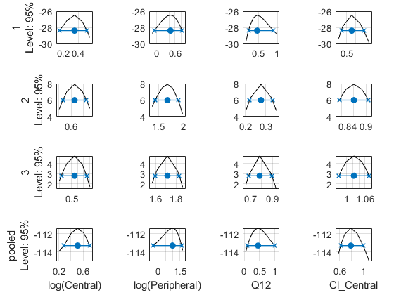
Plot the negative profile likelihood curves for the unpooled fit. The parameter bounds defined in the original fit are displayed by vertical dotted lines (if visible in the parameter range being plotted). The confidence interval is indicated by two crosses and a line in between them. The center dot denotes the parameter estimate. The profile likelihood is always plotted in the log scale. The x-axis scale depends on whether the parameter is transformed (log, probit, or logit scale) or not (linear scale).
plot(ciParamUnpooledProf,ProfileLikelihood="negative");

Each group is plotted in a separate row, and each parameter is plotted in a separate column.
Plot the curves for the pooled fit.
plot(ciParamPooledProf,ProfileLikelihood="negative");

Plot all the confidence interval results together in the same figure.
plot([ciParamUnpooledProf;ciParamPooledProf],ProfileLikelihood="negative");