plotParameterStats
Show box plot, violin plot, and swarm scatter plots for parameter estimates
Since R2026a
Syntax
Description
plotParameterStats(
generates a box plot, violin plot, or swarm scatter plot of the parameter estimates in
fitResults,plotStyle1)fitResults.
plotParameterStats(
specifies to generate multiple plots, where 1≤ N ≤ 3. For example,
fitResults,plotStyle1,...,plotStyleN)plotParameterStats(fitResults,"box","violin","swarm") plots all three
available plots.
Examples
This example uses data collected on 59 preterm infants given phenobarbital during the first 16 days after birth [1]. Each infant received an initial dose followed by one or more sustaining doses by intravenous bolus administration. A total of between 1 and 6 concentration measurements were obtained from each infant at times other than dose times, for a total of 155 measurements. Infant weights and APGAR scores (a measure of newborn health) were also recorded.
Load the data.
load pheno.mat ds
Convert the dataset to a groupedData object, a container for holding tabular data that is divided into groups.
data = groupedData(ds);
Create a simple one-compartment PK model with bolus dosing and linear clearance to fit such data. Use the PKModelDesign object to construct the model.
pkmd = PKModelDesign;
addCompartment(pkmd,"Central",DosingType="Bolus",...
                    EliminationType="linear-clearance",...
                    HasResponseVariable=true,HasLag=false);
[onecomp,map] = pkmd.construct;
Describe the experimentally measured response by mapping the appropriate model component to the response variable.
map.Observed
ans = 1×1 cell array
    {'Drug_Central'}
Map the Drug_Central species to the CONC variable.
responseMap = "Drug_Central = CONC";The parameters to estimate in this model are the volume of the central compartment Central and the clearance rate Cl_Central.
map.Estimated
ans = 2×1 cell
    {'Central'   }
    {'Cl_Central'}
Specify a log transform for the estimated parameters so that the transformed parameters follow a normal distribution. Use an estimatedInfo object to define such transforms and initial values (optional).
estimatedParams = estimatedInfo(["log(Central)","log(Cl_Central)"],InitialValue=[1 1]);
Each infant received a different schedule of dosing. The amount of drug is listed in the data variable DOSE. To specify these dosing during fitting, create dose objects from the data. These objects use the property TargetName to specify which species in the model receives the dose. In this example, the target species is Drug_Central, as listed by the PKModelMap property Dosed.
map.Dosed
ans = 1×1 cell array
    {'Drug_Central'}
Create a sample dose with this target name and then use the createDoses method of groupedData object data to generate doses for each infant based on the dosing data DOSE.
sampleDose = sbiodose("sample",TargetName="Drug_Central");
doses = createDoses(data,"DOSE","",sampleDose);
Fit the model.
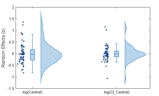
[nlmeResults,simI,simP] = sbiofitmixed(onecomp,data,responseMap,estimatedParams,doses,"nlmefit");Display the variation of estimated parameters using box plots.
plotParameterStats(nlmeResults,"box")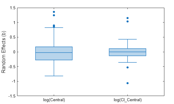
Display the empirical distribution of each parameter estimate by showing a violin plot of each estimate.
plotParameterStats(nlmeResults,"violin")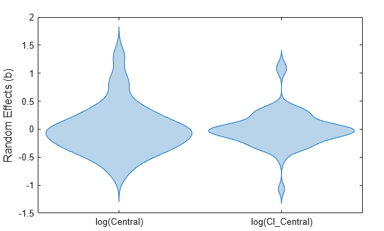
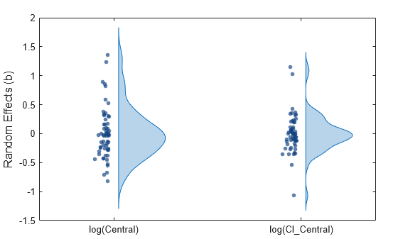
Display parameter estimate values as a swarm chart, which is a scatter plot with the points offset (jittered) in the x-dimension
plotParameterStats(nlmeResults,"swarm")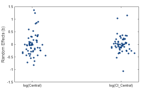
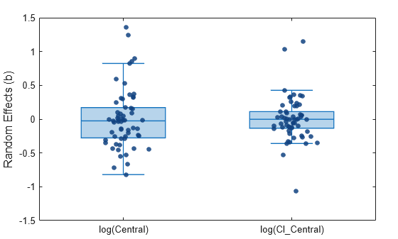
Display the box plots and swarm charts together.
plotParameterStats(nlmeResults,"box","swarm")
Show the swarm charts and violin plots together.
plotParameterStats(nlmeResults,"swarm","violin")
Show all three plots.
plotParameterStats(nlmeResults,"box","swarm","violin")
Input Arguments
References
[1] Grasela T.H. Jr, and Donn S.M. "Neonatal population pharmacokinetics of phenobarbital derived from routine clinical data." Developmental Pharmacology and Therapeutics 8, no. 6 (1985): 374–83. https://doi.org/10.1159/000457062.
Version History
Introduced in R2026a