ttplot
Description
ttplot plots transition functions of threshold
transitions. To evaluate the transition function for observations of the threshold variable,
use ttdata.
ttplot( plots transition bands between
states of the threshold transitions tt)tt on the
y-axis. The plot shows gradient shading of the mixing level in the transition
bands.
ttplot(
uses additional options specified by one or more name-value arguments. For example,
tt,Name,Value)ttplot(tt,Type="graph") specifies plotting a line plot of the
transition function at each threshold level on the same axes.
ttplot(
plots on the axes specified by ax,___)ax instead of the current axes (gca) using any of the input argument combinations in the previous syntaxes.
h = ttplot(___)h to the threshold transitions plot. Use h to modify properties of the plot after
you create it.
Examples
Create discrete threshold transitions at 0 and 2.
t = [0 2];
tt = threshold(t)
tt =
  threshold with properties:

          Type: 'discrete'
        Levels: [0 2]
         Rates: []
    StateNames: ["1"    "2"    "3"]
     NumStates: 3
tt is a threshold object. The specified thresholds split the space into three states.
Plot the threshold transitions.
ttplot(tt);

ttplot graphs a gradient plot by default. The -axis represents the value of the threshold variable (currently undefined) and the state-space:
The system is in state 1 when .
The system is in state 2 when .
The system is in state 3 when .
Because the transitions are discrete, ttplot graphs the levels as lines—the regime switches abruptly when crosses a threshold variable.
Because is undefined, the -axis is arbitrary. When you specify threshold variable data by using the Data name-value argument, the -axis is the sample index.
This example shows how to create two logistic threshold transitions with different transition rates, and then display a gradient plot of the transitions.
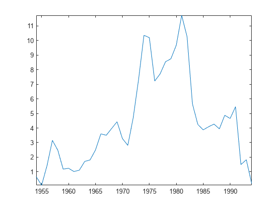
Load the yearly Canadian inflation and interest rates data set. Extract the inflation rate based on consumer price index (INF_C) from the table, and plot the series.
load Data_Canada
INF_C = DataTable.INF_C;

plot(dates,INF_C);
axis tight
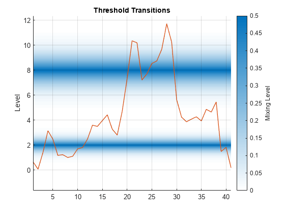
Assume the following characteristics of the inflation rate series:
Rates below 2% are low.
Rates at least 2% and below 8% are medium.
Rates at least 8% are high.
A logistic transition function describes the transition between states well.
Transition between low and medium rates are faster than transitions between medium and high.
Create threshold transitions to describe the Canadian inflation rates.
t = [2 8];      % Thresholds
r = [3.5 1.5];  % Transition rates
statenames = ["Low" "Med" "High"];
tt = threshold(t,Type="logistic",Rates=r,StateNames=statenames)
tt =
  threshold with properties:

          Type: 'logistic'
        Levels: [2 8]
         Rates: [3.5000 1.5000]
    StateNames: ["Low"    "Med"    "High"]
     NumStates: 3
Plot the threshold transitions; show the gradient of the transition function between the states, and overlay the data.
figure
ttplot(tt,Data=INF_C)
Create normal cdf threshold transitions at levels 0 and 5, with rates 0.5 and 1.5.
t = [0 5];
r = [0.5 1.5];
tt = threshold(t,Type="normal",Rates=r)
tt =
threshold with properties:
Type: 'normal'
Levels: [0 5]
Rates: [0.5000 1.5000]
StateNames: ["1" "2" "3"]
NumStates: 3
To compare the behavior of the transition functions, plot their graphs at the same level.
figure
ttplot(tt,Type="graph",Width=20)
Plot the transition functions at their levels. Evaluate the transition function over a 1-D grid of values by using ttdata, and then plot the results.
lower = tt.Levels(1) - 3/min(tt.Rates);
upper = tt.Levels(end) + 3/min(tt.Rates);
z = lower:0.1:upper;
F = ttdata(tt,z,UseZeroLevels=false);

figure
plot(z,F,LineWidth=2)
grid on
xlabel("Level")
legend(["Level 0, Rate 0.5" "Level 5, Rate 1.5"],Location="NorthWest")

Create smooth threshold transitions for the Australian to US dollar exchange rate to model price parity.
Load the Australia/US purchasing power and interest rates data set. Extract the log of the exchange rate EXCH from the table.
load Data_JAustralian
EXCH = DataTable.EXCH;
Consider a two-state system where:
State 1 occurs when the Australian dollar buys more than the US dollar (
EXCH).State 2 occurs when the US dollar buys more than the Australian dollar (
EXCH).States are weighed more highly as the system deviates from parity (
EXCH= 0).
Create threshold transitions representing the system. To attribute a greater amount of mixing away from the threshold, specify an exponential transition function. Set the transition rate to 2.5.
tt = threshold(0,Type="exponential",Rates=2.5)tt =
threshold with properties:
Type: 'exponential'
Levels: 0
Rates: 2.5000
StateNames: ["1" "2"]
NumStates: 2
Plot the threshold transitions with the threshold data.
figure
ttplot(tt,Data=EXCH);

Try improving the display by experimenting with the transition band width (Width name-value argument).
figure
ttplot(tt,Data=EXCH,Width=2);

Plot the transition function.
figure
ttplot(tt,Type="graph");
Input Arguments
Name-Value Arguments
Output Arguments
More About
Tips
Use the
Widthname-value argument to adjust the display of transition function graph (Type="graph") plots with varying rates. In multilevel gradient plots (Type="gradient"), a large enough width results in overlapping transition bands that can misrepresent data. By default,ttplotchooses an appropriate width for displaying all transitions.
Version History
Introduced in R2021b