Implement Box-Jenkins Model Selection and Estimation Using Econometric Modeler App
This example shows how to use the Box-Jenkins methodology to
select and estimate an ARIMA model by using the Econometric Modeler app. Then, it
shows how to forecast responses from the estimated model. The data set, which is
stored in Data_JAustralian.mat, contains the log quarterly
Australian Consumer Price Index (CPI) measured from 1972 and 1991, among other time
series.
Prepare Data for Econometric Modeler
At the command line, load the Data_JAustralian.mat data
set.
load Data_JAustralianImport Data into Econometric Modeler
At the command line, open the Econometric Modeler app.
econometricModeler
Alternatively, open the app from the apps gallery (see Econometric Modeler).
Import DataTimeTable into the app:
On the Modeler tab, in the Import section, click the Import button
 .
.In the Import Data dialog box, select the check box for the
DataTimeTablevariable.Click Import.
The variables, including PAU, appear in the
Time Series pane, and a time series plot of all the
series appears in the Plot(EXCH) figure window.
Create a time series plot of PAU by double-clicking
PAU in the Time Series
pane.
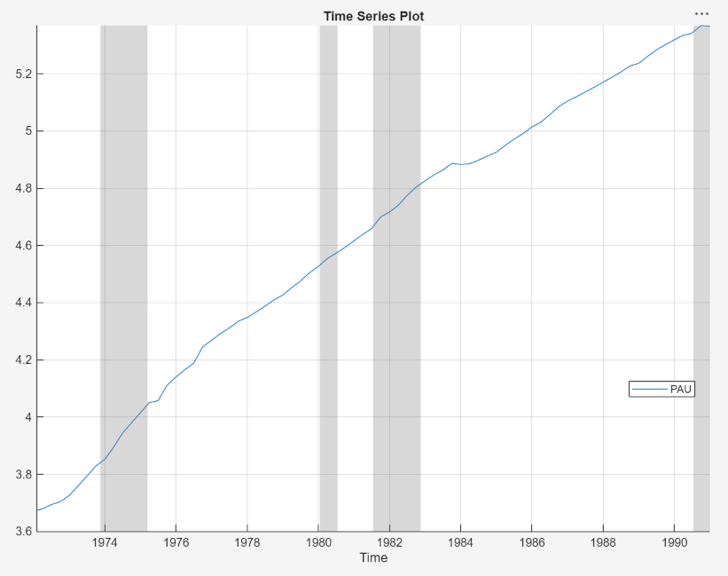
The series appears nonstationary because it has a clear upward trend.
Plot Sample ACF and PACF of Series
Plot the sample autocorrelation function (ACF) and partial autocorrelation function (PACF).
In the Time Series pane, select the
PAUtime series.Click the Plots tab, then click ACF.
Click the Plots tab, then click PACF.
Close all figure windows except for the correlograms. Then, drag the ACF(PAU) figure window above the PACF(PAU) figure window.

The significant, linearly decaying sample ACF indicates a nonstationary process.
Close the ACF(PAU) and PACF(PAU) figure windows.
Difference the Series
Take a first difference of the data. With PAU
selected in the Time Series pane, on the
Modeler tab, in the Transforms
section, click Difference.
The transformed variable PAU_Diff appears in the
Time Series pane, and its time series plot appears in
the Plot(PAU_Diff) figure window.
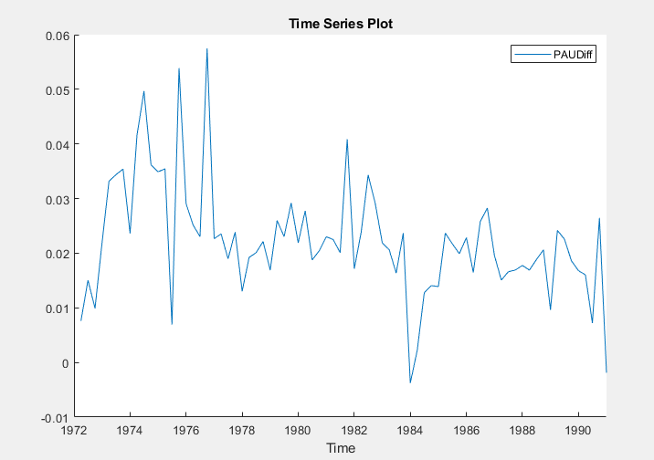
Differencing removes the linear trend. The differenced series appears more stationary.
Plot Sample ACF and PACF of Differenced Series
Plot the sample ACF and PACF of PAU_Diff. With
PAU_Diff selected in the Time
Series pane:
Click the Plots tab, then click ACF.
Click the Plots tab, then click PACF.
Close the Plot(PAU_Diff) figure window. Then, drag the ACF(PAU_Diff) figure window above the PACF(PAU_Diff) figure window.

The sample ACF of the differenced series decays more quickly. The sample PACF cuts off after lag 2. This behavior is consistent with a second-degree autoregressive (AR(2)) model for the differenced series.
Close the ACF(PAU_Diff) and PACF(PAU_Diff) figure windows.
Specify and Estimate ARIMA Model
Estimate an ARIMA(2,1,0) model for the log quarterly Australian CPI. This model has one degree of nonseasonal differencing and two AR lags.
In the Time Series pane, select the
PAUtime series.On the Modeler tab, in the Models section, click ARIMA.
In the ARIMA Model Parameters dialog box, on the Lag Order tab:
Set Degree of Integration to
1.Set Autoregressive Order to
2.
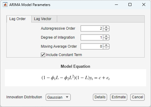
Click Estimate.
The model variable ARIMA_PAU appears in the
Models pane, its value appears in the
Preview pane, and its estimation summary appears in the
Fit(ARIMA_PAU) document.
Both AR coefficients are significant at a 5% significance level.
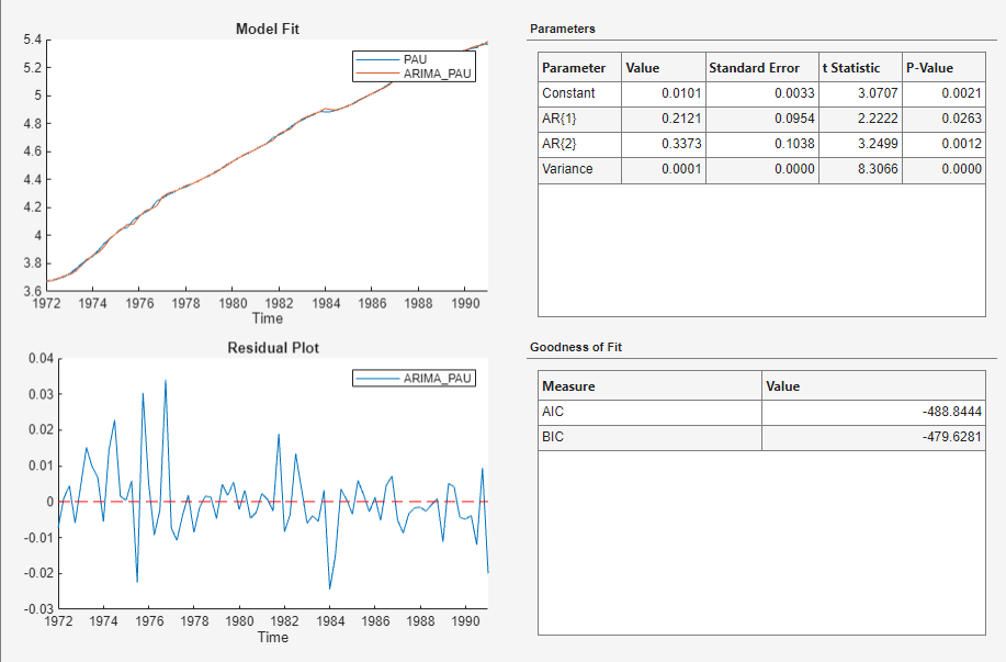
Check Goodness of Fit
In the Fit(ARIMA_PAU) document, inspect the fit results to assess the goodness-of-fit.
In the Model Fit figure, the time series plot of the data and fitted values shows a good in-sample fit.
In the Residual Plot figure, the residual series is centered at zero, but shows possible volatility clustering (higher variance at earlier residuals than those later in the series) or that the innovations distribution is heavy tailed.
In the Goodness of Fit table, the Durbin-Watson statistic in the is close to 2, which suggests little residual autocorrelation.
Check that the residuals are normally distributed and uncorrelated by plotting a histogram, quantile-quantile plot, and ACF of the residuals.
Close the Fit(ARIMA_PAU) document.
With
ARIMA_PAUselected in the Models pane, on the Modeler tab, in the Diagnostics section, click Model Fit Diagnostics > Residual Histogram.Click Model Fit Diagnostics > Residual Q-Q Plot.
Click Model Fit Diagnostics > Residual Autocorrelation.
In the right pane, drag the Hist(ARIMA_PAU) and QQ(ARIMA_PAU) figure windows so that they occupy the upper two quadrants, and drag the ACF so that it occupies the lower two quadrants.
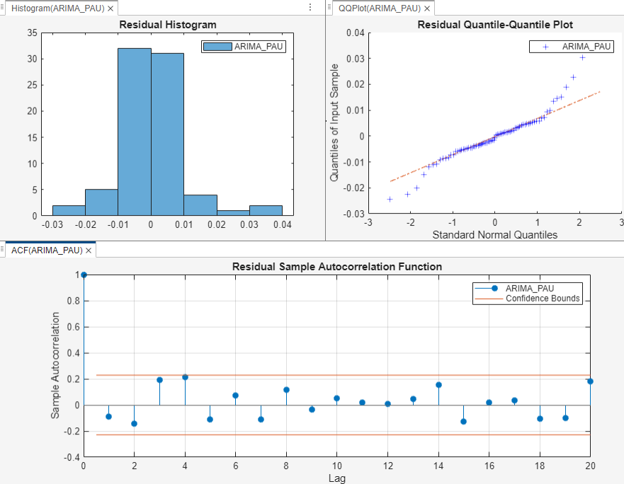
The residual plots suggest that the residuals are approximately normally distributed and uncorrelated. However, there is some indication of an excess of large residuals. This behavior suggests that a t innovation distribution might be appropriate.
Generate MMSE Forecasts
Generate MMSE forecasts and approximate 95% forecast intervals from the estimated ARIMA(2,1,0) model for the next four years (16 quarters).
In the Models pane, select the
ARIMA_PAUmodel.On the Modeler tab, in the Forecast section, click Forecast.
In the Forecast Model Response dialog, set Number of periods in forecast horizon to
16.Click Forecast.
In the right pane, close all figure subsections so that the plot in the For(ARIMA_PAU) tab displays.

References
[1] Box, George E. P., Gwilym M. Jenkins, and Gregory C. Reinsel. Time Series Analysis: Forecasting and Control. 3rd ed. Englewood Cliffs, NJ: Prentice Hall, 1994.
See Also
Apps
Objects
Functions
Topics
- Analyze Time Series Data Using Econometric Modeler
- Perform ARIMA Model Residual Diagnostics Using Econometric Modeler App
- Programmatically Select ARIMA Model for Time Series Using Box-Jenkins Methodology
- Detect Serial Correlation Using Econometric Modeler App
- Share Results of Econometric Modeler App Session
- Creating ARIMA Models Using Econometric Modeler App