このページの内容は最新ではありません。最新版の英語を参照するには、ここをクリックします。
表形式データからのヒートマップの作成
ヒートマップとは、色を使ってデータを可視化する方法です。この例では、ファイルを table として MATLAB® にインポートする方法と、table 列からヒートマップを作成する方法について説明します。また、タイトルや軸ラベルの設定など、ヒートマップの外観の変更方法を示します。
ファイルを table としてインポート
2015 年 1 月から 2016 年 7 月までの毎日の平均気温を含んだサンプル ファイル TemperatureData.csv を読み込みます。ファイルを table として読み取り、最初の 5 行を表示します。
tbl = readtable('TemperatureData.csv');
head(tbl,5)
Year Month Day TemperatureF
____ ___________ ___ ____________
2015 {'January'} 1 23
2015 {'January'} 2 31
2015 {'January'} 3 25
2015 {'January'} 4 39
2015 {'January'} 5 29
基本的なヒートマップの作成
月を x 軸、年を y 軸に表示するヒートマップを作成します。温度のデータを使用してヒートマップ セルに色を付けるために、ColorVariable プロパティを設定します。HeatmapChart オブジェクトを変数 h に代入します。チャートを作成した後で変更を加えるには、h を使用します。
h = heatmap(tbl,'Month','Year','ColorVariable','TemperatureF');
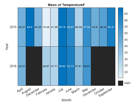
MATLAB では既定で色データが各月の平均気温として計算されます。ただし、ColorMethod プロパティを設定して計算方法を変更することができます。
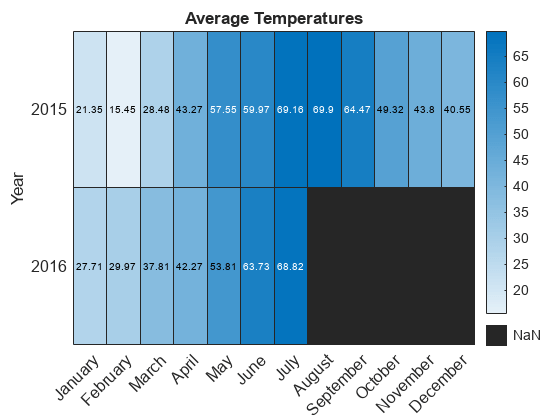
軸の値の並べ替え
軸の値は、アルファベット順に表示されます。時系列で表示されるように月を並べ替えます。ラベルは、categorical 配列を使用するか、HeatmapChart プロパティを設定してカスタマイズできます。
categorical 配列を使用するには、最初に table の Month 列のデータを cell 配列から categorical 配列に変更します。次に、関数 reordercats を使用してカテゴリを並べ替えます。これらの関数はワークスペースの table (tbl) または HeatmapChart オブジェクトの SourceTable プロパティに格納されている table (h.SourceTable) に適用できます。HeatmapChart オブジェクトに格納された table にそれらを適用することで、元のデータへの影響が回避されます。
h.SourceTable.Month = categorical(h.SourceTable.Month);
neworder = {'January','February','March','April','May','June','July',...
    'August','September','October','November','December'};
h.SourceTable.Month = reordercats(h.SourceTable.Month,neworder);
同様に、categorical 配列用の関数 addcats、removecats、または renamecats を使用して、ヒートマップのラベルを追加、削除、または名前変更することができます。
あるいは、HeatmapChart オブジェクトの XDisplayData プロパティと YDisplayData プロパティを使用して、軸に沿って値を並べ替えることができます。
h.XDisplayData = {'January','February','March','April','May','June', ...
    'July','August','September','October','November','December'};
タイトルと軸ラベルの変更
表形式のデータを使用してヒートマップを作成する場合、ヒートマップは自動的にタイトルと軸ラベルを生成します。タイトルと軸ラベルをカスタマイズするには、HeatmapChart オブジェクトの Title、XLabel、および YLabel プロパティを設定します。たとえば、タイトルを変更し、x 軸ラベルを削除します。フォント サイズも変更します。
h.Title = 'Average Temperatures';
h.XLabel = '';
h.FontSize = 12;
欠損データ セルの外観の変更
2016 年 8 月から 2016 年 12 月のデータがないため、それらのセルは欠損データとして表示されます。欠損データ セルの外観は、MissingDataColor プロパティおよび MissingDataLabel プロパティを使用して変更します。
h.MissingDataColor = [0.8 0.8 0.8];
h.MissingDataLabel = 'No Data';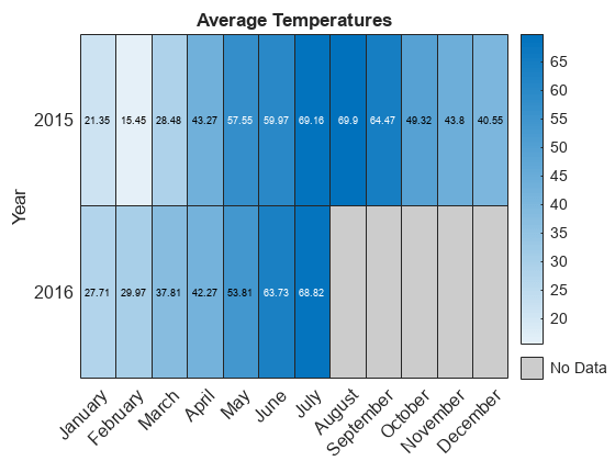
カラー バーの削除
カラー バーを削除するには、ColorbarVisible プロパティを設定します。
h.ColorbarVisible = 'off';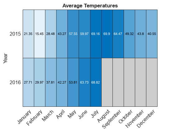
セルのテキストの書式設定
各セルに表示されるテキストの書式をカスタマイズするには、CellLabelFormat プロパティを設定します。たとえば、テキストを小数点以下の値なしで表示します。
h.CellLabelFormat = '%.0f';
軸の値の追加または削除
XDisplayData プロパティを設定して各四半期の最初の月だけを表示します。YDisplayData プロパティを設定して y 軸に 2017 年を追加します。これらのプロパティを、それぞれ XData または YData の値からなるサブセット、スーパーセット、または順列に設定します。
h.XDisplayData = {'January','April','July','October'};
h.YDisplayData = {'2015','2016','2017'};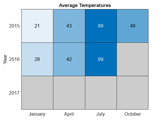
2017 年に関連付けられているデータがないため、ヒートマップ セルでは欠損データの色が使用されます。
参考
関数
heatmap|table|readtable|addcats|removecats|renamecats|reordercats|categorical
プロパティ
You can also select a web site from the following list:
Americas
- América Latina (Español)
- Canada (English)
- United States (English)
Europe
- Belgium (English)
- Denmark (English)
- Deutschland (Deutsch)
- España (Español)
- Finland (English)
- France (Français)
- Ireland (English)
- Italia (Italiano)
- Luxembourg (English)
- Netherlands (English)
- Norway (English)
- Österreich (Deutsch)
- Portugal (English)
- Sweden (English)
- Switzerland
- United Kingdom (English)